Data Visualization Choices for Sales Presentations
The right chart type closes deals faster than polished complexity ever will.
Sales presentations run on data, but the data isn't what closes deals. The chart choice does. A strong number in the wrong chart type doesn't just fall flat, it actively confuses or bores the person who's supposed to say yes, and a busy buyer rarely gives a second shot at re-reading a slide they already dismissed.
Research finds that executives now sit through more than 15 dashboards a week, and most of them still can't say which metric actually needs action. That's not a data shortage. That's a clarity shortage. Visual information sticks at roughly 65% retention versus about 10% for plain text, and the brain processes an image tens of thousands of times faster than it processes words on a page. That gap cuts both ways: a well-matched chart lands instantly, and a badly matched one wastes that same speed working against you. The standard for 2026 is the chart that gets understood, and acted on, the fastest, not the most polished or intricate chart on the slide. It's the one that gets understood, and acted on, the fastest. The chart isn't the point anymore. The insight is. The chart's only job is delivering one clean "so what" before the buyer's attention moves on. What follows is a decision framework, not a tour of chart types for their own sake.
The persuasive jobs a sales slide needs to do
Every chart in a sales deck is doing one of four jobs, whether the rep planned it that way or not.
Establishing scale makes a buyer feel the size of a problem or an opportunity. Showing trend proves direction and momentum over time. Proving contrast makes one option look clearly better than another. And compelling urgency shows what happens if nothing changes, or what delay actually costs.
A standard framework frames the sales deck as a narrative: introduce the problem, present the solution, show results, close with a clear ask. Each of those beats lines up with one or more of the four jobs above. The problem section usually needs scale. The results section usually needs contrast or trend. The close often needs urgency.
A growing share of B2B buyers now prefer to skip the rep entirely during parts of the buying process. That means the deck itself is doing more of the persuading, unassisted, without someone in the room to explain what a confusing chart was supposed to mean. So before picking a chart type, label the job first. Scale, trend, contrast, or urgency. The chart type follows from the answer, not the other way around.
When a bar chart works and when it fails
Bar charts win when the story is comparison. Sales figures across regions, survey scores across teams, budget across departments: The human eye is simply better at judging bar length than almost any other visual comparison. That makes bar charts one of the most legible formats available, and it's why they're the right tool for proving contrast or establishing scale.
They fall apart the moment the real story is momentum. A bar chart of quarterly revenue shows four static snapshots. It doesn't show whether the business is speeding up or stalling out, because bars don't carry direction between them, only height at a single point in time. Use one when the story needs trend, and the slide will technically be accurate while completely missing the point.
A muted palette with a single highlight color does a lot of quiet work here: neutral bars supply context, and one accent color tells the eye exactly which bar matters. A clean, practical use case: a side-by-side "before" and "after" bar chart inside a customer case study. That's a contrast job, and bar charts execute it cleanly, without needing any narration.
When a line chart works and when it misleads
Line charts exist to show a journey. Growth, decline, volatility across days, months, or years: A line chart is the format built to carry a dataset's direction, which makes it the natural fit for trend and, often, for urgency.
A declining line showing a prospect's churn rate climbing quarter over quarter makes urgency visible without a single dramatic word attached to it. A line showing a market growing faster than a prospect's current vendor can keep up with does the same work. So does an adoption curve that bends upward hard enough to make a new technology look inevitable rather than optional.
But line charts are also the easiest chart type to quietly distort, and sophisticated buyers know the tricks. Truncating the y-axis can turn a modest gain into something that looks like a dramatic leap, as visualization researchers have documented. Leaving off the data source or the date range lets a viewer assume a story that the numbers don't actually support. Cherry-picking the time window to dodge a bad quarter makes a weak result look strong, right up until someone in finance asks to see the full range. Enterprise buyers and CFOs have seen every one of these moves before. Getting caught running one doesn't just sink that slide, it puts every other number in the deck under suspicion.
A line chart's strength is how simple it is. Stacking a second or third series onto the same axes usually buries the "so what" that made the chart worth showing under the clutter.
Waterfall charts for the revenue story that needs to show cause and effect
A waterfall chart tracks how a starting value moves, step by step, through a series of gains and losses, to land on a final number. It's the chart built for cause and effect, which makes it the right tool when the job is urgency or scale, and specifically when the story is: here's where we started, here's what happened along the way, here's where we ended up.
Revenue bridges are the clearest example. Starting revenue, plus new business, minus churn, equals ending revenue. That structure makes the cost of churn impossible to ignore, because it sits right there as its own labeled block instead of getting absorbed into a single net number. Budget variance analysis works the same way, planned spend against actual spend, with each difference shown as its own column. So does an ROI build, where each component of a solution adds its own increment toward the final return figure.
Most reps skip this chart type and default to bar or pie charts instead, mostly because those are the template defaults sitting in whatever software they're already using. Waterfall charts take more setup. They're worth it anyway. Compare a slide that just states "Q4 revenue was $2M" against a waterfall showing "started at $1.4M, added $900K in new logos, lost $300K to churn, landed at $2M net." The first version is a fact. The second gives the buyer something they can actually act on, because it names exactly where the leak is.
Pie charts in sales decks and when they are a mistake
Pie charts survive in sales decks for a reason that has nothing to do with precision. They feel finished. Round, whole, done, which is emotionally satisfying even when it's mathematically fuzzy. Human eyes are genuinely bad at comparing angles and areas, SR Analytics notes, which makes pie charts one of the least precise formats available for any comparison that actually matters.
There's a narrow band where a pie chart still earns its place. High-level budget breakdowns where the audience only needs an approximate sense of proportion. Market share slides where the entire point is "we're the largest segment," not "here's the exact gap between us and the next competitor." The rule holds either way: if the audience needs to tell slices apart that are close in size, the pie chart will fail them, and a bar chart should take its place.
Picture three competitors each at 34%, 33%, and 33% market share, plotted on a pie. The visual tells the viewer nothing, because three near-identical wedges look like three near-identical wedges no matter how the labels are arranged. A ranked bar chart, or honestly even a plain table, would be more accurate and would land harder. Once a pie chart carries more than four or five segments, it turns into visual noise because there is too much information for the format to carry clearly, which is the signal to simplify the data rather than the chart.
Static vs. interactive charts and which format belongs in a sales presentation
Static charts belong in reports, presentations, and executive summaries, anywhere the goal is one clear takeaway. Interactive dashboards with filters and drilldowns belong in self-service analytics and ongoing operational monitoring. Those are two different jobs, and mixing them up in a sales meeting costs more than it seems to at first glance.
A buyer in a sales meeting isn't there to explore a dataset. They're there to receive a point and make a call. Hand them an interactive chart and watch the thread break: someone starts clicking filters, the conversation drifts toward a side question about a segment nobody planned to discuss, and the slide's actual argument gets lost. A static chart forces the seller to make the editorial call ahead of time, which is exactly the discipline the persuasive-job framework demands.
Interactive dashboards do have a home. They belong in the follow-up, handed to the evaluation team that needs to verify the underlying numbers after the meeting ends. The strongest setup pairs a static executive summary for the room with an interactive version for whoever has to double-check the math later.
A chart also has to work wherever it's actually seen, a slide, a PDF report, a phone screen, each with its own constraints on size and legibility, Statspresso notes. Designing for that medium isn't optional. A growing share of B2B buyers now favor less rep involvement, so decks increasingly travel alone, opened on someone's laptop with nobody there to explain the chart out loud. That chart has to carry its own insight, full stop.
How AI-assisted design tools are changing the chart creation workflow for sales teams
AI presentation tools in 2026 have moved past "type a prompt, get a deck." The better ones now build presentations that embed brand, data, and narrative structure together as one system, rather than spitting out a generic layout that still needs a full redesign afterward.
The time savings appear in real numbers. Adobe reported up to a 60% cut in concept creation time using AI-assisted design systems. McKinsey found that AI can cut product development time by as much as half. Deloitte's figures put adopters of AI-enabled design systems at 20 to 30% faster time-to-market. Those aren't small margins.
Speed isn't the whole story, though. The Designer Fund's 2026 report found that unreliable output is the single most common complaint designers have about AI tools, and the biggest reason a tool gets dropped from a workflow. Applied to charts specifically: an AI tool can generate a chart in seconds, but if it picks the wrong chart type for the persuasive job at hand, speed didn't fix anything, it just produced the wrong answer faster. The framework from the sections above still has to come from the seller. The tool executes it. Every chart needs to come out as a fully editable design, not a locked image, because the numbers will change, the story will shift, and a flattened AI output can't be fixed without starting over from scratch. Adoption is already near-universal: 91% of designers now use AI for design tasks weekly, up from 54% a year earlier, per the Designer Fund and Foundation Capital's AI in Design report. This isn't an experimental phase anymore.
Brand consistency as a chart design constraint, not an afterthought
Inconsistent branding is a commercial problem, not just an aesthetic complaint. It's a commercial one, per Marq: it confuses buyers, slows down execution, drains creative teams, and in regulated industries, it can trigger actual compliance problems.
That friction is visible day to day in creative teams' workflows. Marq reports that when brand assets are scattered across shared drives and personal desktops, creative teams spend their time answering asset requests and fixing branding mistakes after materials already went out the door, instead of doing work that actually moves the brand forward. A locked template system would have prevented those hours lost to friction.
At the chart level, the stakes are concrete. The highlight color in a bar chart has to match the brand's actual accent color, or buyers start reading emphasis incorrectly slide after slide. Axis labels and chart titles need the same typography as the rest of the deck, because inconsistent fonts read as noise and chip away at the "instant understanding" a chart is supposed to deliver. And without a locked template, different reps end up building different chart styles for the same underlying data, which quietly breaks the coherence of whatever master narrative sales leadership is trying to tell across the whole team.
A coherent 2026 brand visual system typically governs color, typography, photography, layout, and AI image generation rules wherever AI enters production. Chart design sits right at the intersection of color, typography, and layout, so it should be governed centrally, not improvised by each rep on their own.
Governance and self-service aren't actually opposites when the system is built right. When organizations centralize go-to-market resources through a unified enablement system, reps tend to grow more self-sufficient while marketing retains control of the underlying assets. That's the model: a locked design system that reps can move fast inside of, rather than one that slows them down.
A practical decision framework for choosing the right chart in any sales moment
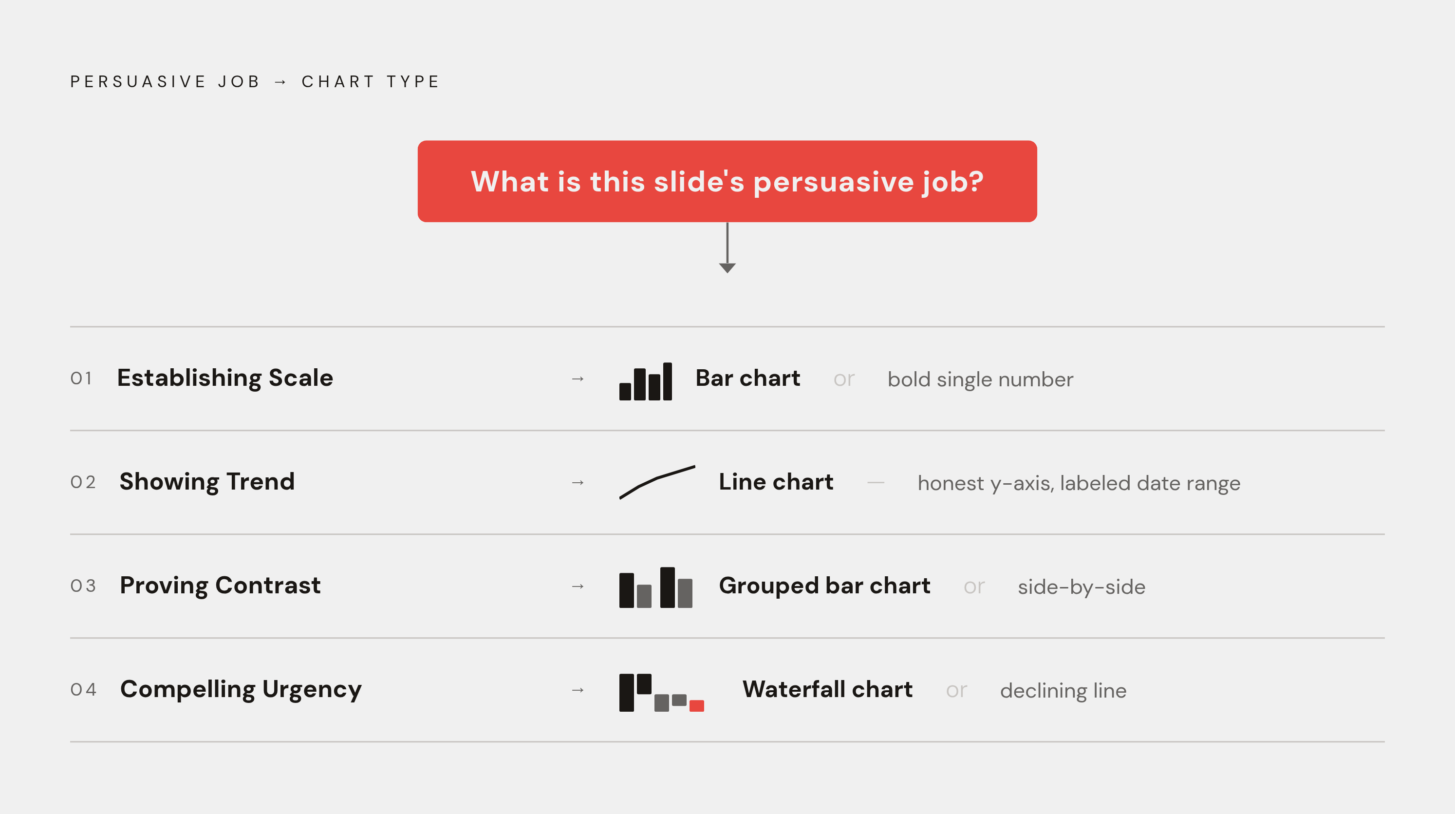
Strip everything above down to a single question asked before any chart gets built: what is this slide's persuasive job?
If the job is establishing scale, reach for a bar chart, or sometimes a single bold number backed by a supporting chart underneath it. If the job is showing trend, use a line chart, with an honest y-axis and the date range labeled in plain sight. If the job is proving contrast, a bar chart, side-by-side or grouped, does the work cleanly. If the job is compelling urgency, a waterfall chart showing the cost of inaction, or a declining line chart tracking the current trajectory, makes the stakes visible without needing a single exaggerated word. And if the job is only showing approximate proportion, where precision was never the point, a pie chart works, capped at four segments or fewer.
None of this requires fancier software or a more elaborate chart. It requires naming the job before touching the template. That one habit, done consistently, separates decks that close from decks that just look busy.