Slide Makeovers for Text-Heavy Presentations
Restructure crowded slides to let audiences absorb one idea at a time.

Diagnosing a text-heavy slide before redesigning it
Text-heavy slides fail because of structure, not substance. Most of what's crammed onto a crowded slide is correct and often useful. It's been formatted like a memo instead of a slide. Fix the structure, and the same content turns into something an audience absorbs in seconds instead of decoding for a minute.
When a slide is packed with sentences, the audience has to choose between reading the screen and listening to the person talking. They can't do both well at once. That choice isn't neutral, either: the brain processes images far faster than text, so a slide full of bullet points fights the audience's wiring instead of working with it. A cluttered slide sends a signal before anyone says a word, telling the room whether the presenter's thinking is organized enough to trust. That impression forms in the first few seconds, long before the talking starts.
There's a cost that compounds, too. Every crowded slide forces viewers to spend mental energy parsing the layout instead of absorbing the message. That tax adds up across a 20 or 30-slide deck, and by slide 15 the audience is tired in a way that has nothing to do with the content itself.
The failure is almost always structural: information that hasn't been translated into a shape the eye can take in fast. It's information that hasn't been translated into a shape the eye can take in fast. Because the failure is structural, the fix is structural too, and it follows a specific, repeatable sequence.
Start with the five-second test. Look at a slide, count to five, and ask whether the single point it's making is obvious. If it isn't, the slide is overcrowded, no matter how well-written the sentences on it are.
Count ideas, not words. A slide with 60 words expressing one idea just needs trimming. A slide with 60 words expressing six separate ideas needs to be split into six slides, not edited down, because trimming a multi-idea slide only produces a shorter version of the same confusion.
Three qualities tell you whether a slide is working. Clarity means one main idea, not several. Hierarchy means the eye lands on the most important thing first. Consistency means fonts, colors, spacing, and alignment behave the same way slide to slide. Run every slide through those three questions before opening a design tool.
From there, work through the same checklist every time:
Check the headline first. Does it state an insight, or just label a topic? "Revenue grew 40% in Q3" tells the audience something. "Revenue" tells them nothing. A slide with a label instead of a message-led headline is usually pasted straight from a document someone else wrote for a different purpose.
Check the bullets next. Are they short and parallel in structure, or are some of them full sentences? Full-sentence bullets belong in speaker notes, not on the screen. Find one, and that's usually a sign the whole slide was built for reading rather than presenting.
Check the visual-to-text ratio. If a slide runs more than 70% text, flag it. Which fix applies depends on what kind of content is crowding it, and that's what the next few sections cover.
Check hierarchy last. Where does the eye land first? If the honest answer is the title, then a wall of bullets that all look equally important, the hierarchy is broken, full stop.
Once a slide is tagged (too many ideas, too many words per idea, no hierarchy, or data dressed up as prose) the right makeover move gets obvious fast.
The one-idea-per-slide rule and how to split slides that break it
The single biggest cause of text-heavy slides is someone cramming three or four points onto one slide to hit a page count or "save slides." That instinct runs backwards. A shorter deck full of overloaded slides takes longer to present and longer to understand than a longer deck of clean ones, so slide count is the wrong thing to optimize for.
Splitting is mechanical once the pattern is visible. Find the distinct claims buried inside the bullets and give each one its own slide with its own message-led headline. A slide trying to say three things ends up saying none of them clearly, because the audience can't tell which one is the actual point and which are just supporting detail.
Research into B2B deck performance found that decks running over 20 slides see engagement drop by 35% in the second half. More, shorter, single-idea slides beat fewer dense ones, up to a point, and every slide in the deck has to earn its place by moving the audience toward a decision. Ask that question of every slide after a split: does this move the audience toward the decision they need to make, or does it just make the team look thorough? Cut anything in the second category, or shove it into an appendix where it belongs.
A few practical tells that a slide needs splitting. The headline has "and," "also," or "in addition" in it, which usually means two ideas wearing one headline. The bullets fall into two or more clusters that don't really talk to each other. Some bullets carry context and some carry the actual point, in which case the context belongs in speaker notes, not on the slide.
Replacing bullet lists with layouts that show structure visually
A bullet list is words describing a structure that already exists. The fix shows that structure directly, with layout instead of language doing the work.
Most bullet lists hide one of a handful of patterns, and each pattern has a visual form that fits it better than prose ever will. A list of parallel items becomes an icon grid or a set of cards, so the eye has a visual anchor for each one and scans in a predictable order. A sequence of steps becomes a process flow with numbered nodes running left to right or top to bottom. A comparison of two or three options becomes side-by-side columns, each with its own header. A ranked set of priorities becomes a tiered layout or a pyramid, never a bulleted list that visually implies everything matters equally when it doesn't. A cause-and-effect relationship becomes two boxes and an arrow, which does more work than a paragraph explaining the link ever could.
Whitespace is the mechanism that lets the eye separate one element from another before it's read a single word. A crowded layout forces the brain to figure out where one idea ends and the next begins first, so attention gets spent before the content delivers any value.
Typography carries hierarchy too. Two fonts, used consistently, with size, weight, and color signaling what matters most, mean no reading required to figure out where to look first. A workable rule of thumb: two fonts, three to five colors, one grid, applied the same way across the whole deck. No exceptions on slide 24 because it felt different that day.
Four product benefits, written as bullets, take noticeably longer to read and absorb than the same four benefits laid out as an icon grid, because the layout has already done the parsing that reading normally requires.
Turning data tables and number-heavy slides into readable charts
Dropping a spreadsheet screenshot onto a slide just moves a table from one file to another. Nothing about it becomes a slide in the process. A table shows every number in the dataset. A chart's entire job is to make one number matter more than the rest, and if it doesn't do that, it isn't earning its place.
Pick the chart type based on the claim being made, not whatever data happens to be sitting in the file. Trend over time calls for a line chart. Part-to-whole relationships work as a pie or stacked bar, used sparingly, only when the proportion itself is the actual point. Comparing categories calls for a bar chart, horizontal if the category names run long. A relationship between two variables calls for a scatter plot. One dramatic number is often best served with no chart at all, just a big-number callout and a line of context underneath it.
Every chart needs a headline that states the takeaway in plain language. "Revenue grew fastest in the enterprise segment" does more work than "Q3 Revenue by Segment," because it hands the audience the point even if they never study the axes.
Then declutter. Cut gridlines that aren't adding information, drop data labels that just repeat what the axis already shows, and use color to highlight the one bar or line that actually carries the argument. Grey out the rest. Consistent visuals and clear infographics have been shown to improve information recall by roughly 50%, and a cluttered chart hands that advantage right back.
Sometimes a table really is the right call, usually when comparing several attributes across several options at once. If so, strip it down. Kill the alternating row colors that create visual noise for no reason, bold only the column that actually drives the decision, and cut any column that isn't pulling weight on this particular slide.
Using brand consistency and visual templates to make a remade deck hold together
A deck where half the slides have been redesigned and half haven't looks worse than a deck that's uniformly plain. The inconsistency itself reads as a sign of a rushed process, even when every individual slide's content is solid.
The fix is one locked template with fixed margins, a consistent grid, set headline placement, a defined font hierarchy, and a fixed color palette, applied the same way across every single slide.
Design systems pay off in measurable time. Research from Superside found designers working inside a system complete tasks 34% faster, the equivalent of gaining roughly three and a half full-time designers back each week. The same research found that 85% of marketers report brand identity gets misapplied by vendors when no centralized system exists to prevent it. Internal teams building sales decks and leadership updates without a shared template run into the same misapplication, just without a vendor to blame for it.
Some parts of a template should be locked down completely: fonts and their sizes, primary and secondary colors, margins and grid, logo placement, slide numbers. Other parts stay flexible: the actual headline text, the body content, which chart type fits this particular data, which image gets used, whether the layout runs text-left or image-left.
Protecting that system isn't only a designer's job. Once a template exists with the right guardrails built in, anyone on the team can build a slide inside it and stay on-brand without a design review slowing things down.
For teams without a formal system yet, the fastest starting point is building one model slide for each of the five slide types that show up in almost every deck: title, data, comparison, process, and proof or case study. Duplicate those five instead of starting from a blank canvas every time a new one is needed.
Where AI-assisted design tools fit in the slide makeover process
That distinction affects how much editorial judgment the process still requires, regardless of how much faster the slides come together. Teams using AI for presentation building in 2026 report slide creation running up to 40% faster than manual methods, but that gain comes from AI handling structure and layout. The editorial judgment covered in the earlier sections still has to happen somewhere, either before the AI runs or right after it does.
AI genuinely helps in a handful of places: turning raw notes or a strategy document into a logical slide sequence, one idea per slide, suggesting layouts, chart types, or icon groupings that fit the content already sitting on the slide, drafting message-led headlines out of bullet content that was written as a label, and applying locked fonts, colors, and spacing automatically across an entire deck. The stronger tools also support back-and-forth refinement of individual slides instead of a single one-shot output, which makes the tool a working assistant rather than a generator that spits out a finished slide and stops there.
The more capable tools now accept PDFs, spreadsheets, and existing documents as raw input, so a text-heavy report can feed directly into a remade deck, skipping the manual copy-paste step.
None of this removes the need for a human check, and treating it as optional is where these projects go wrong. AI handles production speed and keeps the visuals consistent. A person still has to confirm the data is accurate, the editorial choices make sense, and the deck fits the audience it's actually going in front of.
The output has to stay editable, or none of this holds up. A locked image of a finished slide that can't be adjusted for a different buyer or a different meeting is a dead end. The value of AI-assisted design lives in a result someone can keep changing: a tool where every layout element, headline, color, and chart stays adjustable after generation gives a team both the speed of AI and the control of working in a real, editable canvas. That's what makes the process repeatable instead of a one-off fix applied to a single deck and forgotten.
A repeatable makeover sequence for any text-heavy deck
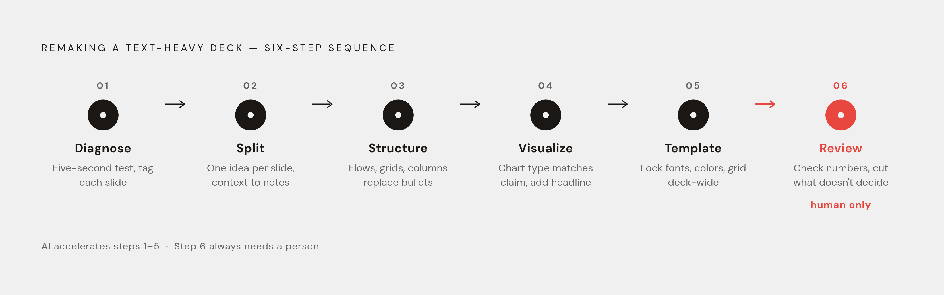
Each step produces the input the next one needs. Picking a chart type before splitting a slide's ideas apart just means redoing the chart later once the split happens anyway, so the order below isn't optional.
Step 1: Diagnose. Run the five-second test on every slide. Then run the clarity, hierarchy, and consistency check on every slide. Tag each one: one idea or multiple, text or data.
Step 2: Split. Break every multi-idea slide into single-idea slides, each with its own message-led headline. Push context into speaker notes or an appendix.
Step 3: Structure the qualitative content. Replace bullet lists with the layout that matches the relationship in the content, such as a process flow, comparison columns, an icon grid, or a tiered hierarchy.
Step 4: Visualize the data. Replace tables and number lists with the chart type that matches the claim being made, add a takeaway headline, and strip out the clutter.
Step 5: Apply the template. Lock fonts, colors, margins, and grid across every slide, then look at the deck as a full sequence and confirm hierarchy and consistency hold from the first slide to the last.
Step 6: Review and validate. Check the numbers are right, confirm every slide pushes the audience toward a decision, and cut what doesn't. That 35% engagement drop past the halfway mark from Sales Benchmark Index is a signal to cut slides, not add more.
AI speeds up steps one through five considerably, especially when it can take an existing deck as input, propose where to split slides, suggest layouts, and apply the brand system on its own. What used to take a few hours can shrink to minutes. Step six still needs a person. It always will, no matter how good the tooling gets.
Run this sequence once, then save the resulting template. Every future deck starts from that system instead of a blank page and a wall of text. The real payoff is a process that keeps producing better presentations. It's a process that keeps producing better ones without starting the whole fight over from scratch each time.