LinkedIn Carousel Design for B2B Audiences
LinkedIn carousels outperform other posts by 200–600% when designed with specific structural rules.

The LinkedIn carousel isn't just a slideshow that happens to perform well. In 2026 it's technically a document post: a multi-page PDF rendered as swipeable slides inside the feed. The reader never leaves LinkedIn to see it. That single design decision by LinkedIn (keeping the viewer on-platform instead of routing them to an external doc viewer) is a big part of why the format now outperforms nearly every other post type in B2B feeds. Buffer's State of Social Engagement report, drawn from a large sample of posts and over 200,000 accounts, put carousel engagement at a median of 21.77%, which comes out to 585% better than text posts, 196% better than video, and 234% better than static images. Oktopost's LinkedIn benchmark data tells a similar story from a different angle: median B2B engagement is 5.72%, but the top decile of pages hit 22.45%, and those top performers post noticeably more carousel content than the median account does. Socialinsider's 2025 numbers are more conservative (1.63% average carousel engagement against 0.51% for static images) but the gap holds regardless of whose methodology you trust.
None of that happens by accident, and none of it happens because carousels are inherently magic. It happens because of a fairly specific set of design decisions: how the file is built, how many slides it runs, what the cover looks like, how information is weighted on each page, and whether the whole thing feels like one coherent brand asset or twelve slides duct-taped together the night before a deadline. This piece walks through each of those decisions in the order a designer would actually face them.
Technical specs and file requirements that affect how carousels render
LinkedIn accepts PDF, PPTX, and DOC/DOCX files for document posts, but only one of those renders consistently across every device and browser: PDF. PowerPoint files go through a conversion process on upload, and that conversion has a habit of dropping fonts or nudging alignment just enough to look sloppy on someone else's screen. A slide that looks perfect in the file might land with text overlapping a logo once LinkedIn gets its hands on it. Export to PDF before uploading, every time, no exceptions worth making.
The platform allows files up to 100 MB and up to 300 pages, though that page ceiling is almost entirely irrelevant. Nobody is losing engagement because they capped out at slide 300; the real ceiling on slide count sits much lower and gets covered in the next section.
Three aspect ratios are supported, and picking the wrong one costs real screen real estate:
Portrait, 4:5 at 1080 x 1350px, is the strongest choice for mobile-first feeds since it takes up the most vertical space on a phone screen; most LinkedIn scrolling happens on phone screens.
- Square, 1:1 at 1080 x 1080px, is a solid middle option and doubles as usable content on other platforms without a redesign.
- Landscape, 16:9 at 1920 x 1080px, works when a slide needs horizontal room, usually for data-heavy layouts with wide charts or tables, but it shrinks in a mobile feed and loses presence.
One rule that gets ignored more than it should: design at native resolution, never smaller and then scaled up. Upscaling introduces blur that's invisible on a laptop preview and obvious on a high-DPI phone screen. It's the design equivalent of photocopying a photocopy and hoping nobody notices the text got fuzzy.
Why the number of slides and the sequence matter
The general range that performs well runs from 5 to 15 slides. Fewer than 5 and the carousel usually doesn't deliver enough to justify the swipe commitment; a reader who taps through three slides and hits a CTA feels like they got shortchanged. Morphica's 2026 research narrows that further, putting 7 to 10 slides as the consistent sweet spot: fewer than 5 feels incomplete, and past 12 the drop-off gets steep unless every single slide is dense enough with value to earn the next tap.
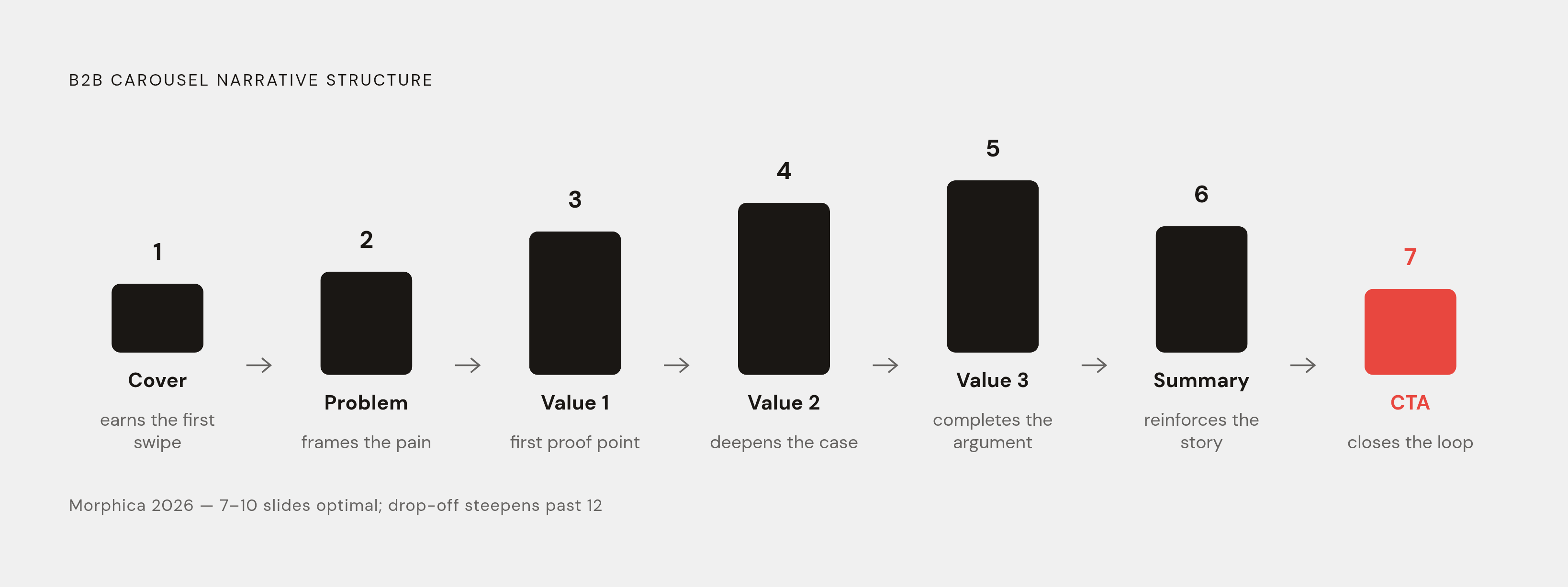
A structure that testing keeps landing on for B2B use runs seven slides, a shape rather than an arbitrary count: cover, problem statement, three core value points, summary, CTA. That's a shape rather than an arbitrary count. Each slide in that arc has a defined role: the cover earns the first swipe, the middle slides do the actual persuading, and the CTA closes the loop. Slide count with that kind of arc is a narrative.
Morphica's editorial rule for getting there is blunt: outline the whole argument first, then cut ruthlessly. If a slide can be removed without losing the thread of the argument, remove it. Every slide left standing has to earn its spot, the same way every sentence in a tight paragraph earns its spot by doing work the sentence before it didn't already do.
Cover slide design and the two-second test
The cover slide has about two seconds to stop a thumb mid-scroll. That's not a copywriting problem but a design constraint: type weight, contrast, and headline size are doing as much persuasive work in that window as the actual words on the slide. Nobody reads a paragraph in two seconds. They read a shape.
In that window, the cover has to do three things at once. It has to signal the topic and the payoff of swiping, so the reader knows what they get before committing to the second slide. It has to carry visible brand identity, so a repeat viewer recognizes the creator on sight, before reading a single word (pattern recognition kicks in before comprehension does). And it has to work as a thumbnail, because the feed preview frequently crops the slide down to a fraction of its full size, so the most important visual information has to sit in the center, not tucked into a corner that gets cut off.
Typography matters more on the cover than anywhere else in the deck. Typography matters more on the cover than anywhere else in the deck. Condensed display fonts carry more visual weight on a small canvas than body-weight type does, so the cover headline is the wrong place for a font built for paragraphs. And color does a job here that's easy to underrate: the most recognizable carousel accounts run one accent color across every slide without fail, and on the cover that color appears as a tag, a border, or emphasis on the headline. After enough posts, that color functions less as decoration and more as a signal, one that readers respond to before they've processed a single word of copy.
Visual hierarchy inside each slide: contrast, type, and the one-idea rule
One idea per slide, under 60 words. That's not a stylistic preference or some trendy minimalism talking point but a direct response to how people actually read LinkedIn carousels, which is by skimming fast and bailing at the first sign of clutter. Cram two ideas onto one slide and the reader has to decide which one matters, and a reader forced to make that decision usually just keeps scrolling instead.
A useful test for whether the hierarchy is working: strip every slide down to just its headline and read them in sequence. If that string of headlines alone delivers the full arc of the argument, the deck passes. If it doesn't, the copy is leaning on body text to do work the headline should be doing, and that's a structural problem, not a wording problem.
Readability holds up when headlines are set large enough to read at a glance, paired with two clean text blocks and strong contrast between text and background. Skip the font that looked elegant in a mockup and unreadable at arm's length. Monospace fonts, DM Mono among them per carouselli.com, have become a common choice for labels and tags specifically because they read as technical and data-driven, which suits B2B and SaaS content without requiring anyone to actually build a chart.
Narrative frameworks that B2B carousels use to earn the full swipe
Visual hierarchy gets the first swipe. It does not get the fifth one. A slide can look gorgeous and still lose the reader by slide three if there's no argumentative pull dragging them forward; the framework that produces this pull matters as much as the design itself.
Five formats appear repeatedly in B2B carousels that hold attention through the last slide:
The step-by-step or how-to format lays out one action with a numbered list visible from the cover slide onward, which sets an expectation early: there are, say, five steps, and a reader who's seen four wants the fifth before abandoning ship.
The Problem, Insight, Solution structure (PSR) mirrors how a B2B buyer actually thinks through a decision. It opens on a pain point specific enough that the reader thinks "that's literally my Tuesday," builds toward a defined insight, and lands on a solution backed by a number. This format appears constantly in SaaS and consulting content because it maps onto the reader's own internal monologue instead of fighting it.
The list or framework format, something like "The 3-C Framework for Positioning," drives saves because a named framework functions as a reusable tool rather than a one-time read. Naming the thing also creates a small curiosity gap (what are the three C's, exactly) that nudges completion rates upward.
Checklists and myth-versus-reality slides earn high save rates because readers bookmark them for later use, and myth-busting in particular tends to pull comments because it invites disagreement, sometimes loudly.
Data breakdown carousels present original data or analysis visually, through charts, pulled-out statistics, or simple tables, and they land hardest when the data pushes against something the audience already assumes to be true.
Carousels consistently rank among the highest-saved post types on LinkedIn, and the common thread across the formats that get saved (checklists, frameworks, step-by-steps) is lasting utility. Nobody bookmarks a post they've already fully absorbed. They bookmark the one they'll need again next month.
Inside the PSR structure specifically, the result slide, the one with the quantified outcome, needs to be the most visually loud slide in the whole deck. Bolder type, the accent color pushed harder than anywhere else, numbers big enough to read at a glance. That slide is doing the heaviest persuasive lifting in the entire carousel, so it should look like it.
Brand consistency across a carousel program, not just a single deck
A single well-designed carousel is a nice one-off. A recognizable carousel program is a different animal entirely, and the difference usually comes down to one decision: does the account run the same accent color on every single slide of every single post, without exception?
Accounts that do this build a pattern-recognition cue over time. Readers stop on the content before they've read a word of it, purely because the color registers first. The accent color's job is structural rather than decorative: it appears on a tag, a slide number, a border, or a CTA button, and its function is to thread every slide and every post together into something that reads as one continuous body of work rather than a pile of disconnected decks.
Morphica's 2026 guidance frames this as a brand kit problem: fonts, background treatment, accent colors, and layout grid, defined once and reused on every deck going forward. Teams that treat each carousel as a brand-new design project, starting from a blank page every time, end up with inconsistent output that never accumulates recognition, no matter how good any individual slide looks.
This is the actual scale problem for GTM teams pushing out carousels regularly. Without a system in place, a team produces duplicated effort or off-brand assets the moment volume goes up, because every new carousel becomes its own design decision from scratch. A brand kit and a set of reusable templates are the infrastructure that lets someone without a design background produce an on-brand carousel without pulling a designer into every single post.
The CTA slide after the last swipe
The CTA slide is the one place in the deck where design intention can't slip, because it's the only slide whose entire job is converting attention into an action. It deserves the same care as the cover, arguably more, since it's the slide standing between a reader who stuck around and a reader who actually does something.
A CTA slide that works states exactly one action, whether that's comment, save, share, DM, or click a link, and resists the temptation to ask for two or three things at once. Multiple CTAs compete with each other, and a reader given a choice between three asks tends to take none of them. The slide should also signal finality visually: the accent color pushed harder than on any earlier slide, bigger type, more white space around it, so the reader feels like they've arrived somewhere rather than just run out of slides to swipe through. And the brand mark, logo or account name, needs to be visible and legible right there, because the last slide is exactly where a reader decides whether to hit follow.
Asking for comments, saves, or shares isn't just good manners, for it's an algorithmic lever. Saves in particular carry outsized weight because they read as a high-intent signal, the kind of engagement that tells the platform's distribution system this content is worth pushing to more people. Data from usevisuals.com shows companies using carousels see a 14% lift in click-through rate to their websites compared to standard link posts, but that lift is conditional. It appears when the CTA slide is actually built to direct a click, not when a link gets tacked onto slide 12 as an afterthought in 10-point type nobody was going to read anyway.
Sources
- LinkedIn carousel best practices for 2026 — Oktopost
- How To Create A LinkedIn Carousel In 2026 [Examples + Tutorials] - Expandi - #1 LinkedIn Automation Tool
- 11 LinkedIn Carousel Examples (+ Post & Ad Ideas for 2026)
- LinkedIn Carousel Best Practices for 2026: What Actually Drives Engagement
- LinkedIn carousel engagement statistics for 2026: The data truth
- LinkedIn Carousel Design: Trends and Best Practices for 2026
- meet-lea.com