On-Brand Social Post Templates for Marketing Teams
Templates let non-designers maintain brand consistency across dozens of social posts weekly.
What on-brand social post templates encode, and why that changes how teams work
A template solves one problem: it takes a brand decision that would otherwise get made fresh on every post and locks it in once, so the person hitting publish, who is usually not a designer, doesn't have to relitigate it. That's the whole pitch, and everything else in this piece is an argument about how far that idea extends once someone takes it seriously.
Marketing teams are shipping more social content, across more channels, than they were three years ago, and the roster of people doing the actual publishing has changed too. It's the salesperson posting a client win, the ops lead announcing a hire, the chief of staff pulling a stat off the quarterly deck. None of them opened a brand guide this morning. None of them are thinking about kerning, and there's no reason they should have to.
Inconsistency rarely appears as a disaster, but as a small mismatch visible in the details. It's a hex code that's close enough but not quite the brand blue. A font substitution because the real one wasn't installed. A logo sitting a few pixels too close to the frame edge, or a caption that reads casual when the last five read formal. No single post looks broken. But if a hundred of these accumulate over a quarter, the brand starts to look like it doesn't know what it is, which is a strange outcome for a company that spent real money defining exactly that.
The cause is structural almost every time, not a personnel problem: teams hire better, train harder, write longer style guides, and the drift keeps happening anyway. Brand decisions tend to live in one of three places: someone's head, a PDF nobody has opened since onboarding, or a Figma file locked behind a designer's login. None of those help a marketer at 4:47pm trying to get a post out before a meeting starts. So she improvises, and when that improvisation multiplies across a dozen people doing the same thing weekly, what looks like scattered small choices is actually one recurring gap wearing different clothes each time. Training the marketer doesn't close that gap. Moving the decision does.
Design systems make templates the rule rather than the exception
A template is not just a pre-made layout, a head start on the blank page. That undersells it badly. A template built correctly encodes the color palette, the type hierarchy, spacing rules, approved image treatments, tone-of-voice boundaries, and, arguably the most load-bearing piece, which elements are locked versus which ones a normal team member can actually touch.
Once those calls get made, nobody has to make them again. Brand colors become fixed fields instead of an open color picker, and nobody outside the design team should ever be choosing a hex value from scratch. Typefaces and their size relationships get set. Logo placement and clear-space rules get baked in rather than eyeballed by whoever's in a hurry. The canvas itself divides into zones, some for images, some for text, so a well-meaning marketer can't jam a headline over someone's forehead by accident. Even CTA placement and button style get decided once, upfront, by someone who thinks about that stuff for a living instead of by whoever opened the file last.
Permissions carry a surprising amount of the weight here, and teams underinvest in this piece most. Everyone on the team can use a template. Almost nobody, aside from a couple of designated leads, can edit the master file. That distinction is the only thing standing between a shared library and forty slightly different versions of the same asset floating around within a month. Version control matters just as much: archive old templates properly, and last year's off-brand green can't sneak back into rotation because someone dug an old file out of their downloads folder.
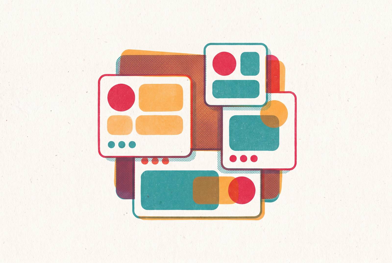
The better libraries are modular. Buttons, text boxes, and photo frames become interchangeable pieces that snap into different templates depending on the moment: a product launch wants something text-heavy, a culture post wants to lead with the photo. A system of parts, instead of a stack of one-off designs, leaves the library with fewer master templates overall and considerably more range out of that smaller set. Fewer files, more flexibility. That trade is the whole design argument in miniature.
LinkedIn demands template discipline more than any other channel
LinkedIn's own numbers make the case without much help. The platform counts 950 million members and 67 million companies, generates 80% of the leads that come from social media for B2B specifically, and converts visitors to leads at a 2.74% rate, a figure that stands out sharply against other social platforms. Ninety-seven percent of B2B marketers already use it for content marketing. Calling this channel a nice-to-have next to the real ones misreads the situation entirely: for most B2B teams, this is the channel, and everything else is a satellite.
The 2026 algorithm shift raised the stakes further. LinkedIn now rewards authentic engagement over raw reach, video over static images, and personal connection over corporate broadcasting. That pivot has a direct, unglamorous consequence for template design, and it's where most teams get this wrong: they build one template system for the company page and assume it covers the channel. They build one template system for the company page and assume it covers the channel, but it doesn't cover the channel. A personal profile posting in a company's voice needs a lighter, more flexible template than a corporate account pushing a press release. The winning setup usually looks like executives, salespeople, and subject matter experts posting from their own profiles, with the company page amplifying rather than originating.
So templates built only for the company account cover maybe half the actual publishing surface. Half the channel goes untouched, and that half is currently winning.
AI workflows plug into a template system to multiply output without multiplying effort
Ninety-six percent of marketers say they already use AI somewhere in their daily role. Most of them are using it the way someone uses a rented drill: pick it up for one job, put it down, no real system behind the choice of when or how. Call it the fragmentation trap. A team adopts a new AI tool, output volume doubles almost overnight, and the work still feels just as scattered as before, maybe more so, because the tool was never the actual bottleneck. No workflow structure exists to catch what it produces.
Content repurposing is where templates and AI actually meet, mechanically. Take a single 1,200-word article. Running it through a repurposing workflow turns it into a LinkedIn thread, three separate Instagram captions, a short post for X, and a pull for the newsletter: five or six distinct outputs from one source document. Every one of those formats needs its own template waiting on the other end. If a team skips that step, the AI-generated draft becomes more raw material somebody has to manually format anyway, which undercuts roughly half the reason for running AI. Teams that build out four to six structured AI workflows report saving an average of 11 hours a week, and repurposing is consistently one of the workflows teams reach for first.
The AI drafts. The template makes sure nobody has to redesign the draft from zero. Skip the template half of that equation and all a team has bought itself is a faster way to generate inconsistent posts.
A practical template library for a go-to-market team to build first
Start with what the team actually posts, not with formats borrowed from a competitor's feed, because that's how a library ends up feeling generic within a month. Map the real content categories: announcements, thought leadership, case study pulls, event promotion, product highlights. Each one has a different visual logic, and forcing all of them into one template is a false economy.
A workable starting set for a B2B go-to-market team looks something like this. A LinkedIn single-image post, headline paired with a supporting visual, brand-locked colors and type throughout. A quote card built for an executive or a customer's voice, with a portrait version and a no-portrait version depending on what's on hand. A stat or data-highlight layout, number-forward, with the sourcing line already built into the frame so nobody forgets where the number came from. A carousel cover plus a matching interior slide template, so a five-slide post doesn't drift in style from slide one to slide five. An announcement template for launches, hires, or partnerships, with a lockup-style logo treatment, and a repurposed-content template built specifically for pulling a blog excerpt or a podcast clip into a feed-ready post.
Build the variations before anyone has to ask for them: seasonal versions, campaign-specific themes, a dark mode and a light mode. This is where the modular pieces earn their keep. Interchangeable buttons, text boxes, and photo frames mean the team needs fewer master templates to cover more ground, instead of a new file for every scenario that comes up.
The locking decision has to happen at build time, not after the fact, and this is exactly where most teams skip a step. Brand colors, logo, and type style should be fixed, no exceptions for a busy afternoon. Image, headline copy, and CTA text should stay editable. Every field left open that shouldn't be is a small door left ajar, and eventually someone walks through it wearing a font they found on their own laptop.
Keeping a template library from going stale as the brand evolves
A team builds a genuinely good template set. The brand refreshes six months later. The templates don't get updated, because the old files are already sitting in forty people's folders, already pinned in whatever tool they use, and old branding keeps circulating quietly because nobody went back and swapped it out. This is the failure mode that actually kills template libraries, more often than bad design ever does, and it's the one nobody budgets time for.
Brand consistency in 2026 doesn't mean sameness anymore, which complicates the fix rather than simplifying it. For years, consistency meant identical logos, identical colors, identical layouts on every surface. That rigid version increasingly clashes with how brands communicate now, across more channels, to more distinct audiences, in more different formats. The templates need built-in flexibility, and that's a genuine tension: too rigid and the brand feels stale across ten channels, too loose and drift creeps right back in through the same door it left by.
Setting maintenance triggers in advance is what keeps a library current instead of merely nostalgic, and this is the discipline most teams never write down. A logo update or brand refresh should trigger a mandatory audit and re-release of the whole set. Adding a new channel should mean building a new template family suited to it, not stretching an old one until it tears. A shift in campaign theme should mean archiving the old seasonal variants and releasing new ones cleanly, rather than letting both versions float around at once, confusing whoever grabs the wrong file. A platform algorithm change, like LinkedIn's 2026 shift toward video and authentic engagement, should prompt an honest look at whether the current templates still match what that platform actually rewards, since they may be optimized for a version of LinkedIn that no longer exists.
The same permission structure that protected the library at launch protects it during updates. Designated leads push new masters. Everyone else pulls from whatever's current, no personal archives treated as gospel. It's a small piece of governance, easy to overlook, but a library that evolves on purpose looks nothing like one that quietly falls out of date while everyone's too busy posting to notice.