Paid Ad Creative Specs Across Meta Instagram LinkedIn
Wrong ad ratios now cost you the auction before your creative even runs.

Getting the dimensions wrong on a Meta ad used to mean a slightly ugly banner. This spec sheet, written by Lukas Minnebeck, co-founder of Superscale AI, was published May 17, 2026 and updated the same day. In 2026, it means losing the auction before the ad even gets a chance to be ugly. Superscale AI notes that a creative rendering at 480×854 instead of 1080×1920 "isn't just ugly — it loses the auction". Meta's Andromeda delivery engine, live globally since October 2025, now scores aspect ratio and resolution as part of how it ranks creative quality, factoring it in from the start rather than leaving it as something a designer checks after the strategy is set. Meta also deprecated standalone desktop right-column-only ad sets in Q1 2026. A file shipped at the wrong ratio reads to the system as a weaker entry, and it loses retrieval chances against competitors that showed up correctly sized. This is the mechanism behind the shift: since Andromeda expanded Meta's ad ranking to process thousands of times more candidates in parallel, creative diversity replaced audience targeting as the primary performance lever. K|Shipping the same product in three ratios instead gives it three separate shots at being retrieved. LinkedIn runs a stricter version of the same logic: files that exceed its limits get rejected on submission, and mismatched ratios get cropped in ways that mangle the layout rather than gently resizing it. Any go-to-market team still building creative square-first and hoping it scales down cleanly is already working against how these systems now decide who gets seen.
The three Meta ratios that cover most of the ad inventory
Three shapes carry nearly the whole Meta ad system. J|Between 4:5, 9:16, and 1:1, roughly 90% of ad delivery across Facebook, Instagram, Messenger, and Audience Network gets covered. A creative team that masters three canvases has covered almost the entire map before touching a single placement-specific spec.
4:5 vertical, at 1080×1350 pixels, is the standard for Feed on both Facebook and Instagram. It claims more mobile screen than a square crop and consistently beats 1:1 on feed performance. 9:16, at 1080×1920, is mandatory for Stories and Reels and is where the bulk of Meta ad spend is heading. And 1:1 square, at 1080×1080, is the fallback that works almost everywhere: Carousel, Marketplace, Right Column, Messenger, all still accept it.
File limits stay consistent across most of these placements: images top out at 30 MB in JPG or PNG, video tops out at 4 GB in MP4 or MOV using H.264 encoding with AAC audio. H|That 4 GB ceiling is a legal limit rather than a target.
Text limits follow a similar pattern at the Meta level: primary text gets truncated before the "see more" cutoff, and headline and description fields carry similarly tight caps. The specific character counts shift by placement: Facebook Feed image is 1080×1350, 4:5 (1:1 supported), JPG or PNG, max 30 MB, minimum 600×600 px, while Instagram Feed image is 1080×1350, 4:5 (1:1 supported), JPG or PNG, max 30 MB, minimum 500 px wide. A|Check Meta's own Ads Guide for whichever placement is actually running before locking copy to a character count.
None of this is the finished answer. A creative uploaded at the wrong ratio is read by Andromeda as a weaker entity and loses retrieval shots in the auction; a product shipped in three ratios gets three distinct retrieval chances.
C|Feed placements and the 4:5 format
For Feed, 4:5 vertical is the operative choice in 2026: 1:1 square is supported but loses roughly a third of the mobile screen and consistently underperforms. The specs run tight and largely mirror each other across the two platforms:
Facebook Feed image: 1080×1350 pixels, 4:5, with 1:1 supported; JPG or PNG; 30 MB max; 600×600 minimum. Instagram Feed image: 1080×1350 pixels, 4:5, with 1:1 supported; JPG or PNG; 30 MB max; 500 pixels minimum width. Facebook Feed video: 1080×1350, 4:5, with 1:1 supported; MP4 or MOV; 4 GB max; longer runtimes are technically allowed, but the ads that perform best hook the viewer early and don't overstay.
Both feeds now share the same recommended dimensions, a 2026 simplification.
The spec that gets violated most often, and the one with a documented cost attached, sits at the bottom of the frame. Meta's guidance calls for keeping roughly the top 14% of a Feed asset clear, about 250 pixels on a 1080×1350 canvas, along with a larger clear band at the bottom. That bottom band is where Meta renders the headline, the call-to-action button, and other engagement chrome, so a logo or key visual sitting there gets clipped for most mobile viewers. Facebook's own Ads Guide covers these dimensions, file sizes, and character limits across image, video, carousel, and collection formats, and now also documents specs for ads on Threads.
An apparel brand with substantial ad spend found this the hard way: its top-performing ads had logo lockups sitting inside that bottom safe zone across most of its portfolio. After stripping the logo out and re-rendering the identical creative files, the same idea, the same media buy, the same audience, thumbstop ratio improved substantially within days on duplicated ad sets. Nothing about the strategy changed. Only the placement of a logo inside a zone the platform was always going to cover with its own interface.
Feed is where the money still lands today. It is not, however, where impressions are growing. That distinction belongs to Reels, and it's the reason the next section carries more weight than its placement in the ad platform's menu might suggest.
Stories and Reels: the safe-zone rules that determine whether the message survives
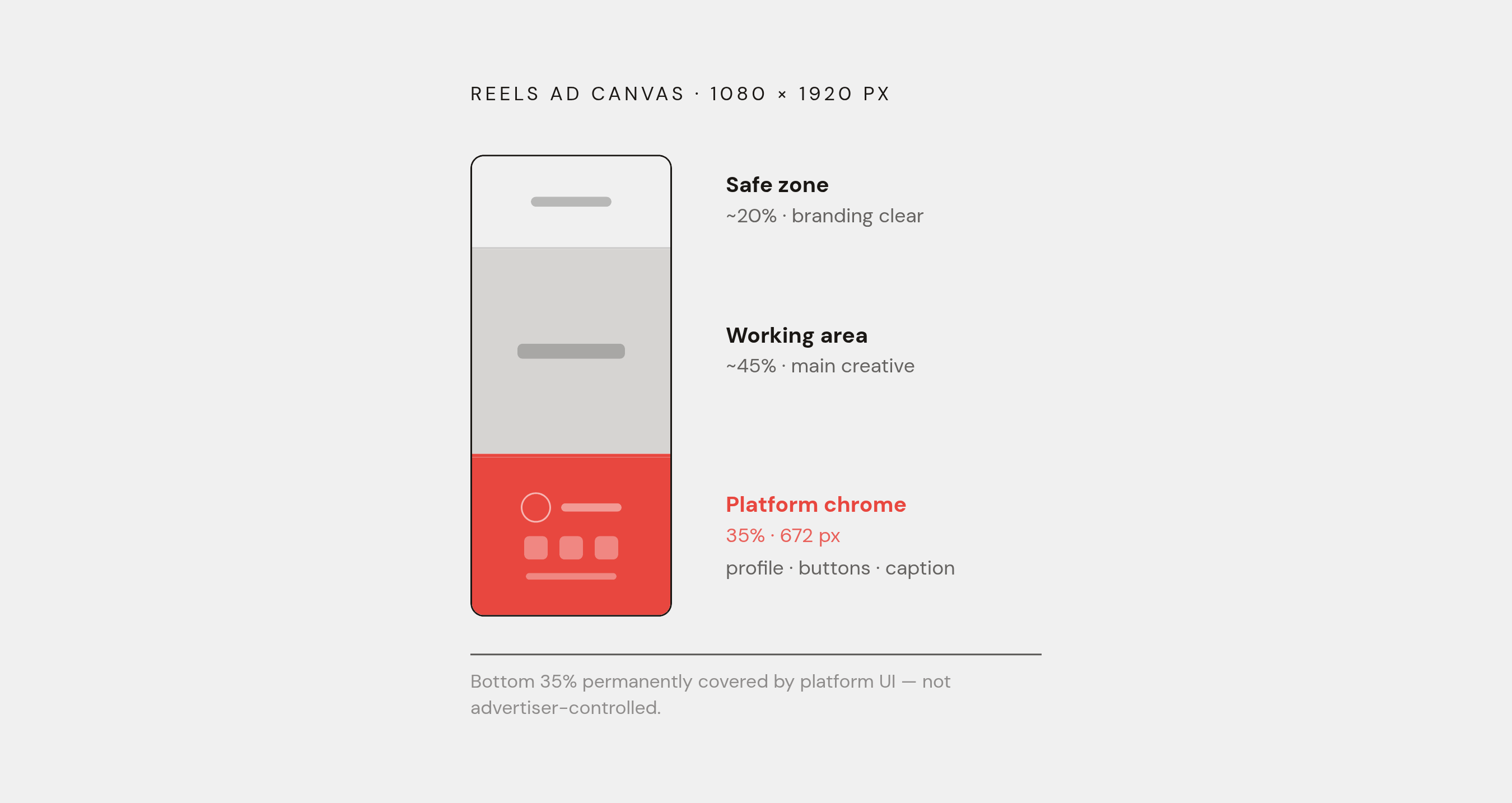
N|Tinuiti's Q1 2026 Digital Ads Benchmark Report found that Reels overtook Feed in share of Instagram impressions during the first quarter of 2026. Any creative library still weighted toward square 1:1 assets is now structurally out of step with where the audience actually is. The dimension requirement is simple enough: both Stories and Reels run at 1080×1920 pixels, 9:16, images capped at 30 MB and video at 4 GB, with Stories video allowing longer runtimes than Reels, which enforces a recommended upper limit. Once the ad is live, the platform's own interface still reshapes that ratio.
Instagram's Reels safe zone asks creators to keep the top, bottom, and both sides clear of text, logos, or any element the message depends on. The bottom band runs considerably larger than the one in Feed, because that's the real estate Instagram needs for the profile picture, the like and comment buttons, and the caption text. Facebook Stories calls for a clear band at both top and bottom, and Messenger Stories follows the identical pattern.
K|Running the math on a standard 1080×1920 Reels asset shows the bottom 35%, something like 672 pixels, is effectively owned by the interface, not the advertiser. A price callout, a product shot, or a call-to-action button placed anywhere in that band gets partially or fully covered by buttons and captions the advertiser has no control over. Designing for Reels means designing around a chunk of the canvas that will never actually belong to the ad.
Reels asks for more than a resized canvas, too. Sound plays automatically, so a video built to work silently is leaving half its design on the table. Content that looks like it was shot on a phone tends to outperform polished, agency-grade production, because Reels is an environment built on organic content and an ad that looks too finished can read as an intrusion. As of January 2026, the standalone Instagram Explore scrollable feed was retired and its ad traffic absorbed into Reels, though the Explore Home grid-tile placement remains active. Shorter tends to win. None of this is a niche concern. K|Reels generates hundreds of billions of plays per day across Meta's platforms, putting the safe-zone rules on par with load-bearing infrastructure rather than a design nitpick.
For advertisers running static images inside Reels rather than video, Facebook's Reels image spec calls for JPG or PNG, 9:16, a 1080×1080 minimum, and the same 30 MB ceiling as everywhere else, though the room for on-image text runs narrower than what Feed allows.
D|The remaining Meta placements
Carousel, Marketplace, Right Column, and Messenger each serve specific use cases, and their specs reflect those contexts (they are not afterthoughts), but most go-to-market teams will deprioritize them relative to Feed and Reels.
Marketplace runs at 1080×1080, 1:1, with a 30 MB image ceiling. It tends to work well for e-commerce and local businesses, since the people browsing Marketplace are already in a buying frame of mind rather than a scrolling one.
B|Right Column, which only exists on Facebook desktop, has a genuine spec discrepancy: one source lists 1080×1080, another lists 1200×628. Anyone running this placement should confirm the current number against Meta's own Ads Guide before building to it. Either way, Right Column carries lower CPMs than Feed, but the reach is limited by its desktop-only delivery, and Meta already deprecated standalone right-column-only ad sets in the first quarter of 2026, which narrows how useful this placement is going forward.
Messenger splits into two specs: Inbox at 1080×1080, and Stories at 1080×1920, both capped at 30 MB. A|Sources on the Messenger Inbox figure are split, with some listing 1200×628 rather than 1080×1080, so confirm that number before locking a design to it. Messenger is a more personal context, since messaging tends to feel more intimate than a public scroll.
In-stream video runs at 1920×1080, 16:9 (1:1 is also supported), with the standard 4 GB ceiling. The best-performing runtimes sit well under the maximum allowed length, and because the frame is wide and shallow, text overlaid on the visual tends to get lost or feel cramped.
Audience Network doesn't have one fixed spec at all. Sizing varies by publisher and ranges anywhere from 9:16 to 16:9, so building for this placement means checking the specific publisher inventory rather than assuming a single canvas will work everywhere.
Instagram Explore deserves a note of its own. Since the standalone Explore feed was retired in January 2026, its ad traffic now flows into Reels. Some spec sheets still list a legacy Explore spec (9:16, JPG or PNG, 500 pixel minimum width, 30 MB max), but that entry is best treated as transitional rather than a placement worth designing for on its own terms.
LinkedIn single-image ads: the spec constraints that reshape copy strategy
LinkedIn's spec environment runs on different logic than Meta's, and the direction of travel is different too. LinkedIn's structural shift runs toward simpler, more efficient B2B formats, where single-image units outperform more complex ones for most objectives.
The sizing itself is straightforward. LinkedIn recommends 1200×1200 pixels (a 1:1 square) for most placements, 1200×628 (a 1.91:1 landscape ratio) as an alternative, and 720×900 (4:5) for a vertical single-image format. LinkedIn actually rejects oversized files rather than compressing them automatically, so a file that clears Meta's threshold with room to spare can bounce entirely on LinkedIn.
Every LinkedIn ad shares a common structure regardless of format: introductory text (truncated on desktop before long copy), a headline (a short visible window), the visual asset, and the CTA button. The introductory text is where the format gets genuinely unforgiving. J|On mobile, that text truncates early. The opening line has to carry the entire hook of the ad before a reader ever taps to expand it. There's no equivalent on LinkedIn to Meta's safe-zone problem, no UI element quietly eating the bottom third of the canvas. The constraint here is almost entirely about words: how much can get said, and how fast, before the platform cuts the sentence off mid-thought.