Founder Personal Brand Visuals on LinkedIn
Consistent visual branding on LinkedIn turns founder profiles into silent salespeople.

LinkedIn now has more than 1.3 billion members, and for founders it has become the closest thing B2B has to a trust exchange. A founder's profile matters more than it used to because of that scale, but scale alone doesn't explain why so many capable people still look invisible on it. Carousels, polls, native video, and AI-generated content are all fighting for the same attention, so a static, passive profile simply doesn't register anymore.
This should make founders uncomfortable. That means the profile is doing sales work even when the founder doesn't log in. And the data on what that silent research turns into is not subtle: 82% of people say they're more likely to trust a company when its leadership shows up and posts on social media, and 74% of B2B buyers say executive thought leadership actively shapes who they trust. There's also a widely circulated figure claiming professionals with active personal brands get 47% more inbound opportunities than those with dormant profiles, though that number traces back to an unverified claim online rather than to any confirmed LinkedIn report, so treat it as directional rather than gospel.
What ties all of this together is noise. The feed is now thick with AI-generated text, paragraphs that read fine but say nothing, produced faster than any human could type them. In that environment, a consistent visual identity becomes one of the only signals left that says a real person is behind the account, making deliberate choices, showing up on purpose. Words got cheap. A recognizable visual signature didn't. Buyers now look up the founder before they look up the company (per the Founder Guide, this "silent research" shapes opinions before any click or follow).
What "on-brand" means for a founder who isn't a designer
Start with what a brand kit is not. It isn't a logo sitting in a folder somewhere.
Without that system, things get messy fast. A marketing hire grabs last year's logo file. When that drift multiplies across a few months, the profile stops looking like one person's voice and starts looking like several interns took turns.
For a founder, being on-brand comes down to three practical things. First, the same colors, the same fonts, and the same photo style appear across every asset, so a scroller half-registers the post as "that person's" before reading a word. Second, a tone that actually matches the content, so a framework post looks structured and clean, a personal story looks warmer and less corporate, and a data point looks sharp and numbers-forward, without any of them breaking the underlying visual system. Third, and this is the part founders skip, editable outputs: templates the founder can actually open and update for this week's post without starting from a blank canvas or waiting on a designer who has a day job doing other things.
Why does any of this move the needle psychologically? Two mechanisms do most of the work. The Mere Exposure Effect says repeated encounters with the same visual identity build familiarity, and familiarity, quietly and before any real conversation happens, turns into preference. Authority Bias does the rest: a founder who shows up looking considered and consistent signals that they've taken their public presence seriously, and that seriousness transfers, almost by association, onto the credibility of their ideas. Neither of these requires design talent. They require repetition.
The four visual assets that define a founder's LinkedIn presence
The profile photo comes first, literally and figuratively. The technical floor is low, needing at least 400 by 400 pixels, decent lighting, a neutral background, and an expression that looks like an actual person rather than a hostage situation. And the aesthetic bar has shifted in an interesting direction: by 2026, authentic tends to beat polished, and a candid, well-lit professional shot often outperforms a heavily retouched studio portrait that reads as stock photography.
The banner is next, and it's the most wasted real estate on the internet. It occupies the largest visual space on the entire profile, and the default LinkedIn blue that ships out of the box tells every visitor, instantly, that no thought has gone into this presence at all.
The Featured section is the founder's visual portfolio on the profile, and it should contain pinned posts, case studies, press mentions, or keynote clips, not be left empty or defaulted. Every item in it carries a thumbnail, and that thumbnail should be designed on purpose rather than auto-generated, because it should communicate what the item is at a glance.
Fourth, and this is where most of the weekly output lives, are post graphics and carousels. This category splits into two formats, single post graphics, a branded image paired with a text post, and carousel or document posts, the multi-slide swipeable PDFs that have quietly taken over the feed. That second format deserves its own section, because the numbers behind it are hard to ignore. 3.
Why carousels are the format doing the most work in the current LinkedIn feed
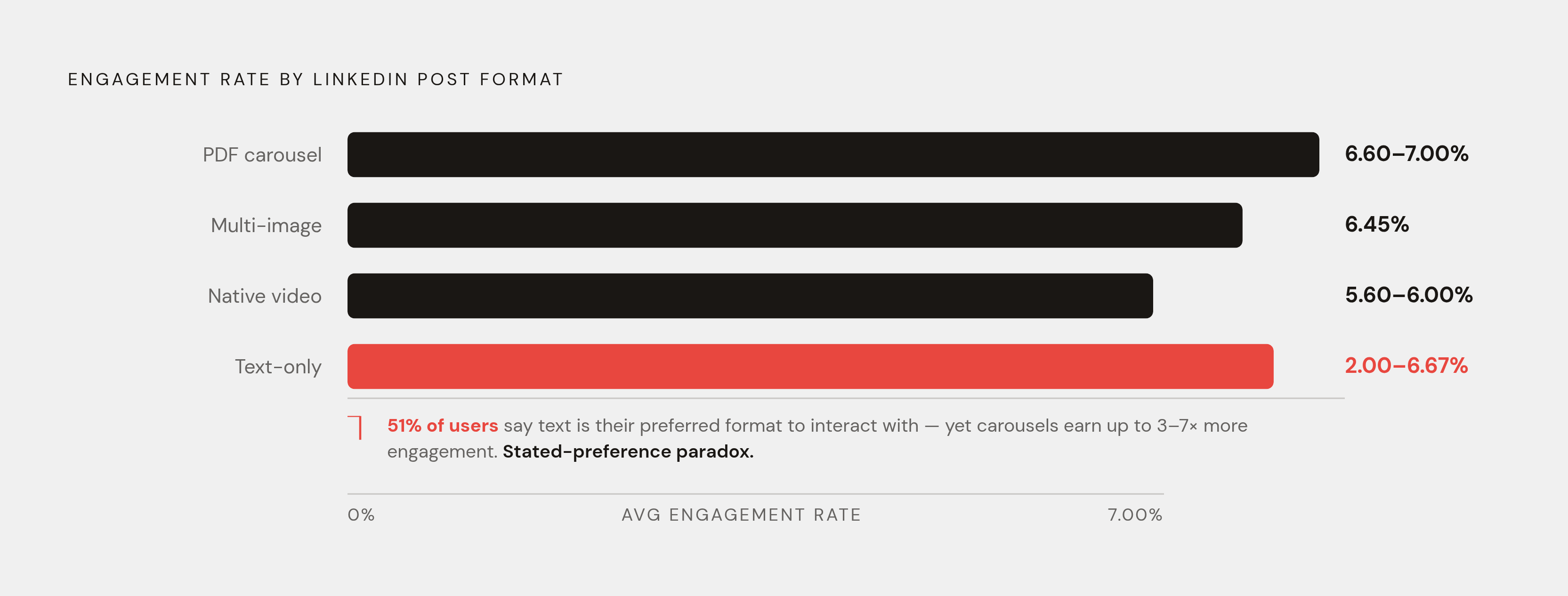
Start with the numbers, because they're the whole argument. Dataslayer's analysis puts document posts, meaning PDF carousels, at a 6.60% average engagement rate, ahead of native video at 5.60% and text-only posts languishing around 2%. Socialinsider's 2026 Organic Benchmarks, drawn from 1.3 million posts across more than 16,000 business pages, puts native documents even higher, at 7.00% average engagement, up 14% year over year, ahead of multi-image posts at 6.45% and video at 6.00%. PostNitro's numbers run hotter still, reporting carousel engagement as high as 24.42% against 6.67% for text posts, a spread wide enough that it should be flagged rather than quietly averaged in. The exact figure moves depending on who's measuring and how, but every single study, regardless of methodology, lands on the same conclusion: carousels win, and they don't win by a little.
Yet something strange happens. Sprout Social's 2026 statistics roundup found that 51% of LinkedIn users say they're most likely to interact with text-only posts when asked directly. That's the opposite of what actually happens when engagement gets measured. Call it the stated-preference paradox: people think they prefer text, and then their thumbs do something else entirely. Founders who plan their content calendar around a survey question rather than a swipe-through metric are optimizing for the wrong signal, and it's an easy trap, because self-reported preference sounds like it should be trustworthy.
Carousels also happen to be the most saved post type on the platform, and a save is a different kind of signal than a like. Nobody saves something they don't intend to come back to, and in a B2B context, a save often sits one step before a lead does. And as overall reach on the platform contracts (AuthoredUp found median impressions falling from 1,211 to 636 per post between June 2024 and May 2025) carousels held up the best of any format, dropping only 43% compared to a 72%-plus collapse for video and a 45% drop for static images. Everything is losing reach right now. Carousels are just losing it slower.
The mechanics behind producing one are almost anticlimactically simple. Building the slides in a design tool and exporting the whole thing as a single PDF lets it be uploaded to LinkedIn as a document post, and the platform automatically converts each page into a swipeable slide. That's not a workaround or a hack someone found in a forum.
What each visual asset should communicate, and the design decisions that make it land
Knowing which assets matter is one thing. Knowing what they should actually say is the harder, more interesting problem.
Start with the banner, paired mentally with the profile photo, because visitors process them together regardless of intent. The banner's job is to answer one question before the visitor even reaches the headline: what does this person do, and who is it for? Treat it as a ten-word billboard. Nobody needs an abstract gradient with a inspirational quote floating in it. In the time it takes to glance, they need to know if this founder is relevant to them. Color continuity between the photo treatment and the banner palette does quieter work here, creating a sense of intention that most visitors won't consciously name but will feel anyway.
Move to the Featured section, where the design decision that matters most is labeling. Each thumbnail should identify what it is at a glance, "Framework," "Case Study," "Press," so a visitor can self-select rather than gambling a click on a mystery box. Think of the thumbnail as a book cover: nobody reads the whole book before deciding to pick it up.
Single post graphics have a narrower, blunter job: earn the first three seconds. SocialBee's data on this is stark: posts that take 60+ seconds to view average a 15.6% engagement rate, while posts skipped in under three seconds average just 1.2%. That gap is the entire argument for treating the graphic as more than decoration. A consistent template, same type treatment, same color logic, same placement for the founder's name or logo, means the graphic itself eventually becomes a recognized signal, the visual equivalent of a familiar voice cutting through a crowded room.
Carousels carry the most granular design decisions of any asset, because each slide is its own small negotiation with the reader's attention. Slide one is the cover, and it has to work as a headline, communicating the value of swiping before the reader talks themselves out of it; that's a design problem wearing copywriting's clothes. From slide two onward, the job shifts to rhythm: consistent layout logic, type large enough to actually read on a phone, one idea per slide, so nobody has to stop and reorient with every swipe. The final slide needs an identity marker, a name, a handle, a small brand element, plus an actual next step, because a carousel that just trails off wastes every bit of attention it worked to earn. And the structural target to build toward is five to ten slides, the range where median engagement consistently peaks; the number should emerge from what the content needs to say.
How to build a repeatable visual workflow without a design team
None of this matters if it can't be produced at a pace a founder can actually sustain, and most advice on this topic conveniently skips that.
Start with the honest version of the problem: assets need to get made consistently, not once, and they need to flex across formats without the founder rebuilding everything from a blank canvas every single week. That's a workflow problem before it's a design problem. And there's a real efficiency case for solving it properly: AI-assisted professionals complete comparable tasks 25% to 56% faster, saving an average of 3.5 hours a week, which adds up to something like 180 hours a year. For a founder juggling content alongside product, fundraising, and everything else on the list, that's not a marginal gain.
The workflow itself breaks into four steps, and none of them require hiring anyone. First, build the visual system exactly once: lock in brand colors, pick one or two fonts, settle on a logo lockup and an approved image style, and turn all of it into reusable templates. Second, build a small template library, not dozens of options, just the handful actually used every week, a carousel cover plus a body slide, a single post graphic, and a banner. Third, produce each post by filling in a template rather than designing from nothing, so the template absorbs the brand-consistency work and the founder is left making content decisions, not layout decisions. Fourth, and this step is easy to skip when things get busy, human review before anything goes live. AI-assisted tools can generate a layout and drop in content, but judgment on message and accuracy stays with the founder, non-negotiably, before publish.
2026 has seen a real consolidation trend, with fewer, more integrated platforms replacing the scattered plugin stacks that founders were stitching together in 2024 and 2025. Rather than bouncing between five different tabs to make one carousel, the more sustainable setup is one tool that handles the whole visual workflow. PDF export for carousel uploads is the output format LinkedIn requires for document posts.
The content cadence that makes visual consistency compound over time
Volume is not the goal here, and the algorithm apparently agrees. Dataslayer's analysis found that LinkedIn rewards depth and expertise over sheer frequency: one genuinely valuable post a week beats five forgettable ones, consistently.
Underneath that is a timing mechanic sometimes called the golden hour. The first 30 to 60 minutes after a post goes live largely decides whether it reaches beyond the founder's immediate network. A strong carousel cover or post graphic raises the odds that the initial slice of the audience actually engages instead of scrolling past, and that early engagement is what gets the post shown further. In other words, the visual work is part of the distribution mechanics. It is the distribution mechanics, at least for the window that matters most.
A workable cadence for most founders starts with one carousel every week or two, since it's the highest-engagement format and it builds a saved-content library that keeps working long after the golden hour closes. Layer in single post graphics for lighter, faster thoughts between carousels, and keep the Featured section and banner updated on a slower cycle, quarterly is reasonable, so the profile's first impression never falls too far behind what's actually being posted. None of this compounds if the visual system resets every few weeks. It compounds because the system stays the same and only the content inside it changes, which is, in the end, the entire point of building one.