Event Announcement Graphics for LinkedIn and Instagram
Platform specs and crop logic differ, so one graphic won't work everywhere.
Getting an event graphic right on LinkedIn and Instagram is mostly a specs problem wearing a design costume. Event announcement graphics were produced for LinkedIn and Instagram.
Why LinkedIn and Instagram crop event graphics differently
Start with the obvious thing that somehow still trips people up every week: LinkedIn and Instagram are not the same platform wearing different colors. They pull different audiences, reward different feed behaviors, and render images through different cropping logic, so building one graphic and pushing it to both is a well-worn path to a banner that gets its headline sliced off.
Consider mobile browsing first, because it changes everything downstream. More than 60% of LinkedIn browsing now happens on mobile I'm Attending I'm Attending. The graphic someone designed at full size on a desktop monitor is very likely not the graphic most attendees ever actually see I'm Attending I'm Attending. What looked balanced and spacious on a desktop preview gets squeezed into a phone-width thumbnail, and whatever sat near the edges is the first casualty.
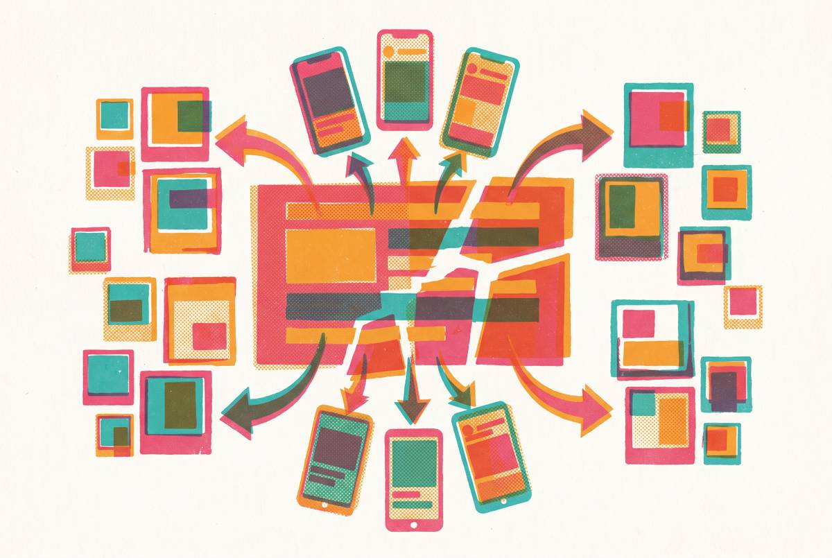
That casualty problem compounds because each surface crops differently within a single platform, not just between platforms. LinkedIn's main feed, its event page, and its profile banner all apply their own crop logic, and Instagram runs the same variety across feed, Stories, and Reels. A single image, resized and reused across every one of those slots, will reliably underperform somewhere in the chain.
What actually goes missing when this happens is not abstract. Dates vanish behind a crop line, a speaker's name gets clipped mid-word, logos slide off the edge of the frame, and the event graphic stops doing the one job it had: telling people when and where to show up. Getting the technical specs right is the entry fee, not the whole game, though. The harder skill, and the one this piece spends most of its time on, is knowing which format serves which placement and how that choice should shape the layout before a single word of copy gets typed in.
LinkedIn image specs for event graphics: every format and its safe zone
The LinkedIn Event Cover banner runs 1776×444px, a 4:1 ratio, and sits as the wide strip across the top of an event page. Mobile cropping tends to eat the outer edges first, so keep the event name and date out of the leftmost and rightmost 20% of the frame. Center that information, make it large and bold, and lean on high contrast rather than clever placement. Viraly.io's 2026 guidance backs the 1776×444px figure specifically and recommends exporting as PNG to keep text edges sharp rather than muddy.
Not every source agrees on this one. Socialez.com describes teams designing this same banner at 1600×900px (16:9) in practice, and cites LinkedIn's own displayed examples running at 480×270 or 1280×720. But the weight of more recent, LinkedIn-specialist sources published in 2026 lines up behind 1776×444px as the primary spec, with a footnote that some platforms may render a 16:9 crop of it depending on where it's viewed. Treat 1776×444px as the build target and expect some display variance downstream.
The profile banner is a separate asset at 1584×396px, also a 4:1 ratio, and it functions as temporary billboard space that literally every visitor to a profile sees. On desktop, the profile photo overlaps the lower-left portion of that banner, and mobile trims the outer edges further, which leaves a safe zone that's really just the center strip of the image.
Feed posts offer three real options, and each one carries a different strategic trade-off rather than a simple better-or-worse ranking. Landscape at 1200×627px (1.91:1) is the standard link-preview shape, a desktop-friendly default that's been around forever LinkedIn Post Size 2026: Image, Video, Document Specs. Square at 1200×1200px (1:1) claims roughly a third more vertical space in the mobile feed than landscape does, renders identically on a phone or a laptop, and is cross-platform compatible with Instagram without modification LinkedIn Post Size 2026: Image, Video, Document Specs. Portrait at 1080×1350px (4:5) is the tallest shape LinkedIn allows, which pushes the caption further down the screen and slows the scroll, making it something of a power-user choice for teams running mobile-first campaigns on purpose.
Carousels get built at 1080×1080px per slide for square, or 1080×1350px for portrait, and the first slide deserves the same care as a standalone post, because that's what it functions as in the feed preview. One rule appears consistently across guidance: always upload at the recommended dimensions or larger, never smaller, since undersized source images get stretched to fit, and the stretching becomes visible first in blurred text and soft logo edges.
Instagram specs for event graphics versus LinkedIn
Instagram's default safe choice for a feed post is portrait at 1080×1350px, the same 4:5 ratio LinkedIn uses for its own portrait option, though it renders inside a different app with different scrolling behavior. Square at 1080×1080px still works, but it loses vertical real estate in the feed and gets cropped down further on the profile grid view, so portrait tends to win by default in most scheduling tools. Instagram has also supported a taller 3:4 ratio at 1080×1440px natively since 2025, for anyone chasing every last pixel of scroll-stopping height.
Stories and Reels run on an entirely separate canvas: 1080×1920px, a 9:16 vertical frame that has no equivalent anywhere on LinkedIn LinkedIn Post Size 2026: Image, Video, Document Specs.
Square (1:1) is the one format that travels cleanly across platforms: a 1200×1200px asset works in the LinkedIn feed and can be exported at 1080×1080px for Instagram without a redesign, and portrait (4:5) also translates between platforms. Landscape (1.91:1) has the same problem on Instagram's mobile-first feed, where its wide, short shape just doesn't compete for attention.
One housekeeping note before export: Instagram caps image file size at 8MB, so keep exports clean and skip the heavy gradients that tend to compress into banding and noise.
Design principles that keep event information readable across formats and screens
Everything above is arithmetic. This section is about what actually happens once the correctly-sized image lands in front of a thumb mid-scroll.
The one-second rule holds that a banner has 1–2 seconds to communicate its message, and if someone cannot understand it at phone screen size, it is too complex, because this rule determines every formatting decision below.
Organizing information into tiers helps make that constraint concrete. What has to register at a glance in Tier 1 is the event name, the date, and the primary visual identity, nothing else. Tier 2, readable once someone actually pauses, covers the speaker name or session title and the location or platform. Tier 3, the material someone finds only if they click through, holds the registration CTA, sponsor logos, and anything secondary. Mixing these tiers, or trying to cram Tier 3 information into Tier 1 space, is the fastest way to build a graphic that reads as noise.
Typography follows the same logic: text needs to be large, bold, and high-contrast against its background, because small fonts are the first thing to blur once a platform compresses the image. A workable test: nothing should be smaller than what a viewer could actually read on a 5-inch phone screen.
Faces do something measurable here, and it's worth taking seriously rather than treating as decoration. Banners featuring faces generate 38% more clicks than abstract designs, which reframes a speaker headshot from optional flourish to something closer to a conversion lever. Negative space matters just as much in the opposite direction: simple graphics with focus on the most important elements outperform busy layouts on mobile, because clutter that reads fine at 1200 pixels wide disappears into noise at 375 pixels.
Consistency compounds across an event's whole graphic set, too. Visual branding held steady across multiple event posts increases profile visits by 45%, which means the goal isn't just reusing a logo, it's building an actual common visual language across every asset in the set. And sponsor logos belong strictly in Tier 3 territory: if a logo falls into the crop zone of any format being targeted, the fix is a separate variant without it, not a compromised primary layout that tries to please everyone and pleases no one.
The three graphic types that serve an event's full lifecycle
Most organizers build one announcement graphic, post it once, and call the job done. That's leaving a lot on the table, because the platforms reward sustained posting across an event's full arc, and each stage of that arc has its own audience and its own intent.
Type 1 is the pre-event announcement graphic, the core asset that communicates the event name, date, format, and reason to show up, optimized specifically to drive RSVPs and registrations. Square (1:1) suits it best for cross-platform reach, while portrait (4:5) works better for LinkedIn campaigns built around mobile. Whatever the shape, it needs an obvious registration CTA, because a graphic that generates interest without pointing anywhere specific has done half a job.
Type 2 is the speaker graphic: talk title, session time, speaker name, and headshot, the asset that matters most to speakers who want to fill their own session and build their own reputation in the process. These graphics matter beyond their own reach, because they're the ones speakers actually share to their own networks, turning each speaker's audience into free distribution for the event. That's not a hypothetical: attendees sharing graphics generated over 250,000 organic LinkedIn impressions at M01N Startup Camp without any paid spend behind it. "I'm Attending" or "Meet Me At" graphics extend that same mechanic to every registrant, not just speakers, so passive RSVP visibility inside LinkedIn Events combines with active attendee posts to build a visibility loop that keeps compounding as more people opt in.
Type 3 is the post-event recap graphic, built around "recap" or "key insights" framing, and it's aimed at a different audience entirely: people who didn't attend, searching or scrolling after the fact. Done well, it just repurposes the visual identity already established in Types 1 and 2, so whatever design work happened upfront keeps paying dividends here rather than starting over. That's really the whole practical payoff for a non-designer: build the template correctly once, and Types 2 and 3 stop being new design problems and start being variations on Type 1, with the system doing the work instead of a person redoing it from scratch each time.
How engagement data rewards getting this right
Numbers make the argument better than adjectives do. LinkedIn's average organic engagement rate is 5.20%, but that average hides a wide spread by format: native document posts reach 7.00%, multi-image posts reach 6.80%, text-only posts fall to 4.30%, and link posts trail furthest back at 3.70%. Visual formats aren't winning by a little here, they're winning by a lot, consistently, across the board.
Zooming in further makes the gap sharper. That's not a rounding error, and it's not marginal, and it compounds across an event's lifecycle when all three graphic types described above get deployed together rather than in isolation.
There's a use for this data beyond satisfying curiosity, too. Anyone trying to convince a manager or a sales lead that spending real time on event graphics is worth the hours can point to these figures directly, without needing to translate design judgment into a business case, because the numbers already make that case on their own. Posts with custom graphics receive 2.3× more engagement than text-only posts, and branded event banners matching a conference's visual identity get 180% more impressions than generic images, both per S1.
A practical workflow for non-designers building event graphics without starting from scratch
A template-first approach sidesteps the pile-up. Building the layout once solves the structure and hierarchy in advance, so the actual job during crunch time becomes swapping copy, applying brand colors, and exporting, not reinventing a design from nothing.
What that template system needs built in from the start: one square (1:1) base layout that works across both LinkedIn and Instagram feeds without modification, one 4:5 portrait variant tuned for LinkedIn's mobile-first crowd and Instagram's feed simultaneously, and one 1776×444px banner variant sized specifically for the LinkedIn Event page. Inside all of those, placeholder zones for event name, date, speaker headshot, speaker name, and CTA need to sit within the safe zones established earlier for every format in play, including the ones that weren't open on screen when the template got built.
Speed is a real, measurable part of the case here, not just a nice side effect. 72% of creative teams now use AI for at least one stage of production, up from 31%, and a campaign asset set that used to take three weeks to produce can now run in about five days with AI handling variation and platform-specific formatting, which makes event graphic sets a fairly contained, low-risk place to actually apply that shift. Consistency also matters: 85% of marketers report that vendors misapply brand identity because there's no centralized system to check against, and a template built on locked brand elements with editable-by-design fields solves that headache without requiring a designer to sign off on every single post.
For a team building this system from zero, the sequence is straightforward. Define the three graphic types the event lifecycle actually needs first, then build or adopt a square base template with the correct safe zones dialed in for both LinkedIn and Instagram. From there, build the portrait and banner variants off that same visual system rather than starting each one separately, decide up front which elements are locked as brand (colors, logo placement, typography) and which stay swappable (dates, copy, headshots), and finally export at the correct specs for each platform and preview everything on an actual phone screen before it goes anywhere near publish. Do this once properly and the second event on the calendar takes a fraction of the time the first one did, because the system, not the person, is carrying most of the weight by then.
A quick-reference spec checklist before publishing
Keep this list open in a second tab. LinkedIn Event Cover runs 1776×444px, with all critical information centered and kept clear of the outer 20% on each side. For the LinkedIn feed, square is 1200×1200px as the recommended default for event posts, portrait is 1080×1350px for maximum mobile real estate, and landscape is 1200×627px, desktop-friendly but weaker on mobile presence. The LinkedIn profile banner is 1584×396px, with a safe zone limited to the center strip since the profile photo overlaps the lower-left on desktop, and carousel slides run 1080×1080px each, with the first slide treated as a standalone post in its own right.
On Instagram, square matches LinkedIn's own square exactly at 1080×1080px, so the same layout applies without adjustment, and portrait holds the same 4:5 ratio at 1080×1350px. Stories and Reels need their own 1080×1920px vertical build entirely, since feed assets simply don't repurpose into that shape.
Before anything actually goes live: export as PNG for text-heavy graphics and check the file stays within each platform's size limits. Then preview it compressed, as a small feed thumbnail, because that's the actual condition under which most people will ever see it, not the full-size canvas view sitting open in the design file.
Sources
- LinkedIn Events Best Practices 2026 — Complete Guide
- LinkedIn Image Sizes 2026: A comprehensive guide
- LinkedIn Image Sizes 2026: Banner, Profile & Post Dimensions
- LinkedIn Event Header Size 2026 — Complete Dimensions Guide + Generator | I'm Attending
- LinkedIn Banner for Events: Create Eye-Catching Event Graphics | 2026 | I'm Attending
- LinkedIn Post Size 2026: Image, Video, Document Specs
- Meet Me At Event Graphics for LinkedIn | Go Spread | Go Spread
- I Am Attending LinkedIn Visuals: The Ultimate Guide | I'm Attending