Proposal Document Design That Closes Deals
Design choices like structure and hierarchy decide whether buyers read proposals at all.

A buyer gets two proposals with the same pricing, the same scope, the same deliverables on paper. One looks like it was built by a team that sweats details for a living. The other looks like someone exported a Word doc at 11:47 PM and called it done. The buyer picks the first one, and the content had nothing to do with it.
A cluttered layout, a logo that's two rebrands out of date, three different fonts fighting for attention on one page, these things tell a buyer something specific about how the vendor operates. If the proposal is sloppy, the engagement might be too. That's not a fair inference to make about a company, but buyers make it anyway, because a document is often the first real work sample they see.
Most go-to-market teams never treat the proposal as a design problem. It gets handed to whoever has a free hour, written as a writing task, with formatting happening last if it happens. That ordering is backwards. Design decisions, structure, hierarchy, consistency, decide whether the content underneath gets read with the attention it deserves. Every section after this one is really an answer to the same question: which specific design choice is quietly deciding the outcome before the buyer reaches the pricing table?
Structure is the first design decision: how a proposal is organized determines whether the buyer keeps reading
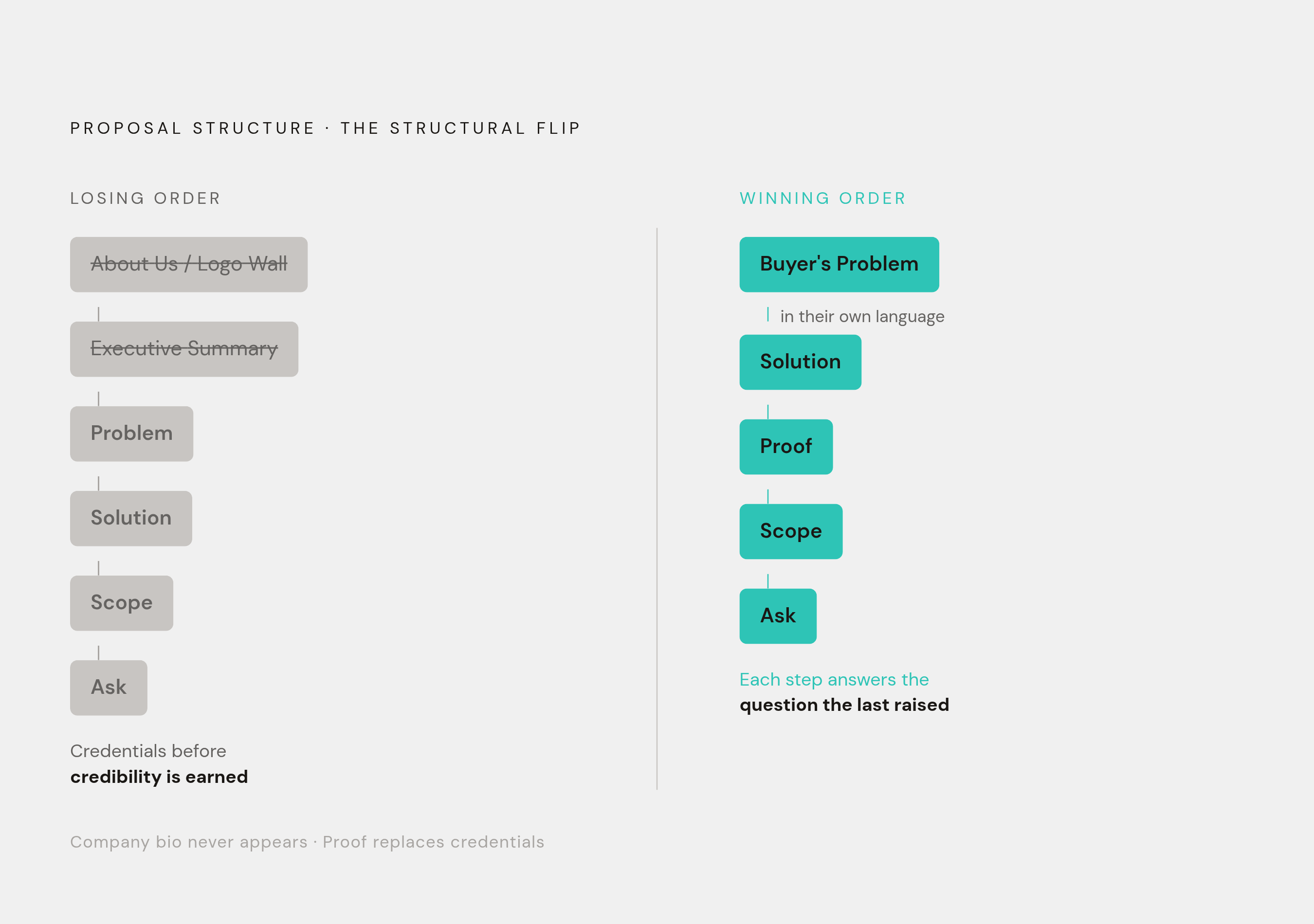
Before a single typeface or color gets chosen, a more basic design decision produces everything else: what order does the information appear in? Sequence is persuasion. A proposal that opens with "About Us" and a logo wall is asking the buyer to care about the vendor before the vendor has demonstrated understanding of the buyer's actual problem. Most proposals do exactly this, burying the executive summary three pages deep, forcing a time-pressed buyer to go hunting for the one answer they actually opened the document to find: why should the buyer care?
The alternative sequence flips the order. Restate the buyer's problem first, in language that sounds like it came from their own meeting notes. Then comes the solution, proof it's worked elsewhere, scope, and the ask. Then scope. Then the ask. Each section answers the question the previous one raised, so the buyer's confidence builds step by step instead of getting interrupted by a company bio nobody asked for.
Sirion's experience with this is a useful anchor because the lesson is structural, independent of any particular tool involved. A decision about where and how proof appeared in the proposal (not buried in an appendix, but placed where the buyer was actively evaluating credibility) changed how the document performed. The point isn't that something got generated faster. The point is that moving proof earlier in the sequence answered a question the buyer was already asking, at the moment they were asking it.
This has a production angle too, one that matters for teams that send proposals weekly rather than occasionally. A fixed structural template, locked in sequence and formatting, enforces consistency so nobody has to reinvent the skeleton every time. The customization work wins or loses the specific deal, and it gets concentrated where it counts: industry-specific framing, a buyer's own vocabulary, a proof point that matches their situation. That customization layer tends to require only a modest amount of extra research per proposal, which is a small cost against what a tailored structure returns in win rate.
Visual hierarchy tells the buyer where to look and in what order (without it, even strong content gets lost)
Structure gets the sections in the right order, while hierarchy decides what the eye does once it's on the page. A proposal without visual hierarchy makes every sentence compete for the same attention, and a buyer who has to work to figure out what matters disengages faster than one who's simply told.
Three tools do almost all of this work, and none of them require a design degree. Typographic contrast, meaning size and weight, separates a heading from body copy from a callout, so the eye knows instantly which line is the point and which is support. Whitespace tells the reader a section has finished and a new idea is starting, functioning less like decoration and more like punctuation for the whole page. Color, used sparingly, signals importance. A proposal that paints every section the same shade of brand blue has used color as wallpaper instead of as a signal, and the buyer's eye has nothing to tell it where to land.
Every decision point in a proposal, the ask, the pricing, the call to action, should be the visually loudest thing on its page. Not shouted in red text like a clearance sale, but weighted so it's unmistakable. Pricing sections make a good test case for this. A paragraph explaining pricing rationale asks the buyer to read and interpret. A structured pricing table, with clear tier separation and a visually distinct recommended option, asks the buyer to glance and decide. The second one wins, consistently, because it does the cognitive work the buyer would otherwise have to do themselves.
Digital and interactive proposal formats raise the stakes on hierarchy. When a buyer can jump straight to the pricing section without reading the problem statement first, hierarchy has to function at every possible entry point, not just across a single linear read from top to bottom. Section headings and visual landmarks need to work harder here, because there's no guarantee the buyer arrives where the sender intended them to start.
Interactive formats also produce something static PDFs never could: data on what buyers actually look at. Engagement-tracked proposals show which sections hold attention and which ones buyers skip. Teams that review that data and redesign around the drop-off points are treating hierarchy as something to test and revise, not something decided once in a template and left alone.
On-brand presentation is not vanity, it is a trust signal that works throughout the proposal
Hierarchy tells the eye where to go. Brand consistency tells the brain whether to trust what it finds there. A proposal with a consistent logo, consistent color palette, consistent type, and a voice that sounds like one person wrote it (even when six people touched the document) signals that the organization behind it operates with some discipline. That's exactly the trait a buyer is quietly evaluating when they read a 20-page scope of work before signing a contract.
The opposite signal is just as loud. A proposal that mixes three fonts, drops in an old logo version, and applies brand colors inconsistently across sections tells the buyer that internal standards are loose somewhere in the organization. Buyers read that as a preview: if the proposal wasn't managed carefully, how carefully will the actual engagement be managed?
Brand drift rarely comes from one careless person. It comes from a team problem: proposals assembled by sales reps, account managers, or operations staff, each pulling from a different folder of old slides and templates nobody's updated. Left alone, drift is the default outcome, not the exception.
The fix is a design system built for people who aren't designers, a template that locks the brand elements (color, type, logo placement, cover layout) while leaving the content areas open for editing. A designer sets the system up once. After that, the team operates inside guardrails without ever having the chance to break them.
Rocketlane is a concrete example of what this looks like in practice. After connecting its proposal workflow to SiftHub's unified knowledge layer, the company cut RFP turnaround in half. Reps stopped rebuilding proposals from scratch for every deal and started pulling verified, already on-brand content in seconds instead of hunting through old files for the right boilerplate.
AI-assisted design platforms extend the same logic further. Rather than generating a static image that looks right once and breaks the moment someone edits it, these tools produce a living, editable document where the brand is built into the structure itself. The brand is baked into the template from the start, not a finishing coat applied at the end and stripped away by the next person who touches the file.
Social proof placement is a design decision with a measurable effect on close rates
Nearly every proposal includes a case study or testimonial somewhere, because sales teams know they're supposed to. Then it gets dropped in an appendix, after the pricing, after the terms, in the part of the document buyers are least likely to read before they've already lost interest or already decided. Including proof isn't the hard part. Placing it where it does persuasive work is.
The design principle here is straightforward: proof belongs directly after the problem-solution statement, not tucked away at the back.
Specificity is itself a design decision, not just a writing one. A case study matched to the buyer's industry, company size, and specific challenge requires someone to curate and lay it out deliberately. A generic logo wall requires nothing but grabbing whatever client logos are sitting in a shared drive. One is evidence. The other is wallpaper with a company's name on it, and buyers can tell the difference even if they can't always articulate why.
Pull quotes deserve their own design treatment too. A testimonial sentence set in larger type, visually separated from the surrounding paragraph, attributed clearly with a name and role, carries more weight than the identical sentence buried mid-paragraph in running text. The visual separation itself is a signal: this claim mattered enough to call out, so pay attention to it. Strip the formatting and the words haven't changed, but the persuasive weight has dropped considerably.
The closing section (the ask, pricing, and next step) is the most design-neglected part of the proposal
Across proposal after proposal, the cover gets a designer's attention, the body gets careful writing, and then the close, the actual ask, the pricing, the next step, gets whatever energy is left after everyone's already tired of looking at the document. That's backwards, because the close is where the decision actually happens.
A closing section that presents pricing in dense paragraphs, buries the call to action somewhere in the fine print, and leaves the buyer unsure what happens next creates hesitation. Hesitation is expensive. Momentum is the asset a well-built proposal spends the previous ten pages building, and a weak close spends it right back down to zero at the exact moment it mattered most.
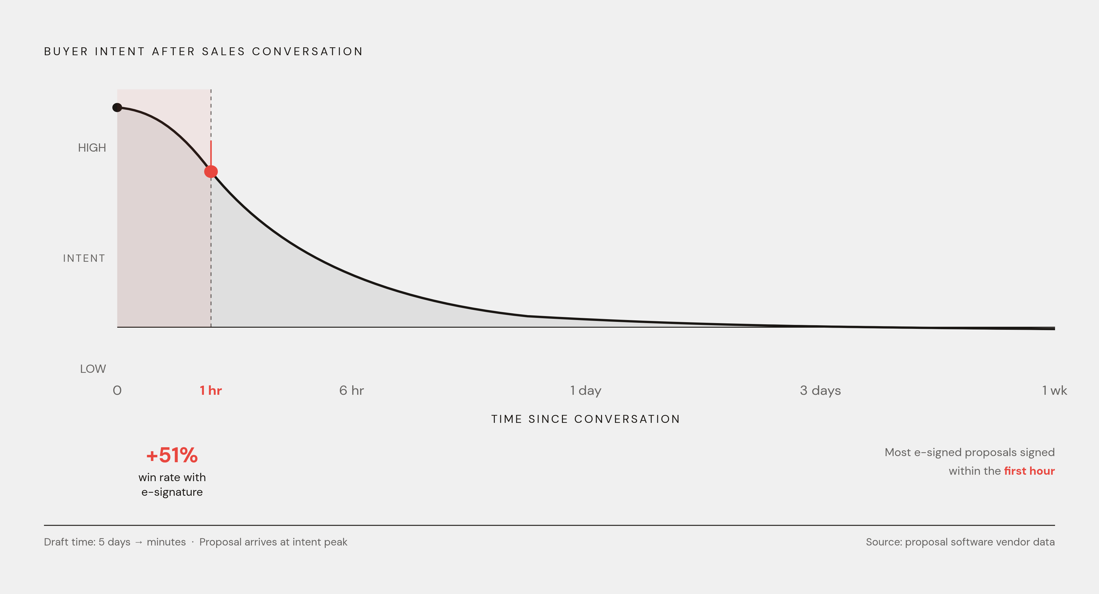
The call to action needs to be the visually loudest thing on the final page, not a modest line of text hoping to get noticed. A signed deal starts with a buyer knowing precisely what to do next and having every bit of friction removed from doing it. E-signature integration isn't a nice-to-have tacked onto the end. Proposals with e-signature built in produce a 51% higher win rate than those requiring a separate signing process, and a large share of e-signed proposals get signed within the first hour of being sent, while the buyer's intent is at its peak and before second thoughts have time to set in.
Speed compounds this effect rather than sitting alongside it as a separate advantage. A proposal that reaches the buyer promptly after the last conversation, and leads them straight into a clear, low-friction close, catches intent exactly when it's highest. Wait three days, and the urgency that existed in that sales call has mostly evaporated, replaced by competing priorities and a half-remembered conversation. One software vendor using AI-assisted proposal generation cut drafting time from five days down to minutes, which meant proposals reached buyers while the conversation was still fresh in their mind. The speed wasn't just operational convenience. It functioned as a design advantage, because it let the close happen while the buyer's attention was still the sender's to lose.
How non-designers on sales teams can produce proposal-ready designs without starting from scratch every time
All of this sounds reasonable, but most people sending proposals aren't designers, and nobody's budgeting for a design hire to format RFP responses. Fair point. The good news is that the gap between well-resourced teams and everyone else has shifted from a talent problem into a tooling problem, and tooling problems are a lot easier to solve.
Using the wrong kind of tool for the job is the failure mode here. A static document editor produces static output that breaks the moment someone edits content without realizing they've also wrecked the formatting. An image-generation tool produces a flat visual nobody can actually edit once it exists. Purpose-built design platforms made for non-designers solve this differently, producing living, editable documents where the brand and structure are built into the template itself.
There's a governance benefit hiding in this that's easy to miss. When the template controls the brand elements, no individual sender can accidentally (or casually) drift away from the company's visual identity. The standard gets enforced at the point of production, not policed after the fact by someone reviewing every outgoing proposal.
AI-assisted platforms push this a step further by generating an initial layout and content structure directly from a prompt, then handing back a fully editable document. Every element stays modifiable, the brand stays intact, and what comes out the other end is a real working document.
BlackLine's experience points at the same underlying principle from a different angle. By launching a Trust Center that lets buyers self-serve on repetitive due diligence questionnaires, the company cut the last-minute scrambles that used to eat up its proposal team's time. The operational win and the design win turned out to be the same thing: a governed system that frees the team to focus on the work that actually wins the deal, instead of the work that could have been templated all along.
None of this requires turning a sales rep into a designer. It requires a system that already thinks like one, so the team can spend its attention on the buyer's problem while the system handles the kerning. The benchmark was always whether the proposal looks like it came from a company with high standards, arrived while the conversation was still warm, and made the next step obvious enough that saying yes took less effort than saying nothing.