Case Study Visual Format for Sales Teams
Scannable visuals turn case studies into tools reps can deploy mid-call without narration.

A case study usually fails for a boring reason: the format makes the prospect work too hard to find the point, and nobody works that hard for a vendor they haven't signed yet. If the outcome, the customer type, and the relevance to her specific headache aren't visible in the first glance, the file gets archived next to eleven others exactly like it.
A format that needs a rep standing next to it, narrating, pointing at the chart, is a liability that travels badly, because the entire premise of a one-pager is that it travels without anyone. The visual hierarchy has to do the talking on its own: a prospect should be able to glance at the page and know what was achieved, who achieved it, and why that has anything to do with her Tuesday. Everything that follows in this piece is about building a page that can do that talking unsupervised.
The Problem–Action–Result arc as the structural spine of every sales case study
Every case study that actually closes deals follows the same bones: a named problem, a specific action, and a result somebody can measure. Call it the PAR arc, structural weight-bearing for the whole case study. Skip it, and the writing drifts toward a feature list, which is the single most common failure mode when a rep sits down to write a case study without a template or a structural guardrail in front of them.
Picture two versions of the same customer story. The other opens with the customer's actual problem (orders misrouted a substantial share of the time, costing a specific number of hours a week), states what was done (a three-week implementation of automated routing rules), and closes with a result (misroutes cut to a small fraction of their former rate). Same company, same product, wildly different persuasive power, because only one of them has a story a stranger can follow without a product demo running in the background.
Each piece of that arc does a specific job once it hits the page. The result block creates desire, the part where the reader starts wanting that outcome for herself. Skip the mapping and the visual design becomes decoration: a beautifully laid-out page sitting on top of an incoherent story still loses the deal, because polish doesn't fix absence of structure.
The obvious objection from a rep with a genuinely complicated deployment: our story is too layered for three boxes. The one-pager's entire job is to be the hook that earns the second conversation.
The visual building blocks of a one-pager that survives being forwarded
Structure comes first, but structure has to land somewhere, and for a one-pager that means six specific visual elements.
The headline carries a quantified result, not the company name and not the product used. A case study with no metric in the headline is a testimonial wearing a case study's clothes.
Then the problem block, kept brief and specific, written in the customer's language rather than the vendor's. A prospect should feel described by this paragraph, not sold to by it. The action block follows, stating concisely what was done. This is the one place the vendor gets to appear by name, and even then it stays subordinate to the customer's story rather than leading it.
The results block deserves the most visual weight on the page: metrics set large, ideally as a before/after contrast rather than a single number floating in space. This is the block that gets screenshotted and dropped into a team chat channel, so it needs to survive being cropped out of context. Finally, the logo, pull quote, and CTA close the page. The logo is an instant credibility signal, the pull quote puts a human voice behind the numbers, and the CTA gives a forwarded reader, who has never spoken to the rep, something to actually do next.
Run every draft through the same test: if a stranger with zero context received this one-pager, would she know the outcome, the customer type, and her next step inside thirty seconds? If the answer is no, something in those six elements is either missing or buried.
Visual hierarchy and layout: how scanning order determines whether the story lands
Having the six elements is necessary but not sufficient.
Eyes move in a fairly predictable path on a printed or PDF page: largest type first, then logos or imagery, then left-aligned text blocks, roughly in that order. Put the number where the eye goes first, because that's where it's going whether anyone planned for it or not.
White space functions as a kind of navigation signal, maybe the most underrated one on the page. A rep who forwards a cramped, six-point-margin wall of text is accidentally telling the prospect that working with this vendor will also require effort, which is not the association anyone wants attached to a sales document.
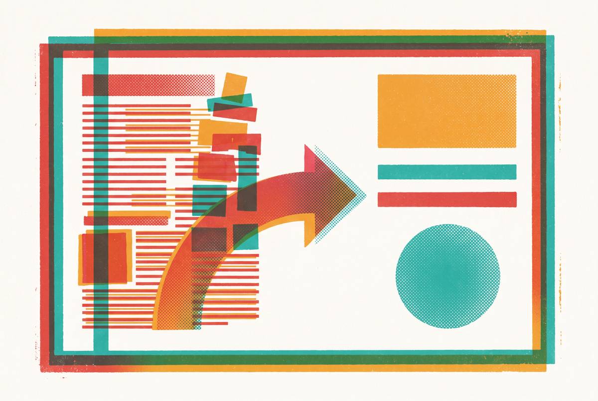
Picture the page split into two columns. The right column carries the proof: the results, the pull quote, the logo, the part a skeptical reader checks before she's willing to invest in reading the left column. That separation lets someone confirm credibility first and commit to the narrative second, which is the opposite order most case studies force on a reader by default.
The pull quote earns its own visual weight too, and that means resisting the urge to shrink it into a styled callout box buried in the middle of a paragraph. Give it room to breathe.
And the objection that always surfaces here: our brand template doesn't allow a layout like that. Brand consistency and layout logic aren't actually in conflict, though. A locked template can enforce both at once, with the brand team controlling the container (fonts, colors, logo placement) while the layout logic controls what goes where inside it. More on that arrangement in a few sections.
Tagging and formatting decisions determine whether reps use the asset in the field
A perfectly designed one-pager that nobody can find, or that a rep can't confirm is relevant to the prospect sitting across from her, produces exactly zero sales value. Most case study libraries fail at retrieval, not creation.
Rich tagging multiplies what a single asset is worth, because it opens multiple search paths into the same file: a case study tagged by industry, use case, company size, region, and sales stage simultaneously can surface in five different searches instead of one. Without consistent tags, the asset exists, technically, somewhere on a shared drive, but existing and being findable in a deal context are not the same thing.
Filenames matter more than most teams admit. A file named "Case_Study_Final_v3.pdf" is effectively invisible inside a CRM search bar, a needle in a haystack made entirely of needles named almost the same thing. A named, tagged, thumbnail-previewed asset, by contrast, is something a rep can locate inside a live deal in under a minute, which is roughly the amount of patience a rep has mid-call before giving up and improvising.
Sales stage tagging gets underused relative to how valuable it is. A case study built for ROI validation at a late stage is functionally a different asset from one built for problem recognition at the top of the funnel, even when it's the same underlying customer story, just reformatted for a different moment in the buyer's thinking. Gabriel Ginorio, Senior Growth Manager at Rippling, described what happens when sellers get better content generation capabilities in their own hands: reduced dependency on marketing and a significant reduction in time to publish. That's a direct consequence of reps being able to find and deploy the right asset themselves instead of filing a ticket and waiting.
The accuracy and governance risk that visual formats create when assets travel without a presenter
The same visual properties that make a one-pager scannable and shareable, large type, prominent metrics, high-contrast result statements, also amplify any error sitting inside those figures once the asset starts circulating without a rep there to add context or caveat.
Enterprise sales AI workflow practitioners flag this risk directly: even a small mistake, an outdated ROI figure, a product claim that's since become misleading, costs real time to unwind and can threaten a deal, erasing whatever time was saved by producing the asset quickly. A one-pager forwarded into a buying committee gets read by people with no relationship to the rep, no way to ask a clarifying question, and no particular reason to interpret a wrong number charitably.
The format itself raises the stakes on the number. A metric set in 48-point bold type reads as a commitment. If that number turns out to be wrong, or simply stale, the size and prominence that made it persuasive also make it harder to quietly correct later.
That risk doesn't argue against the format. It argues for building version control into the same system that already enforces the visual hierarchy. One approved, dated master file per case study, with a clear process for updating the metrics the moment a customer relationship changes or a number gets revised, solves the problem the format itself created.
Locked brand templates, not one-off design files, as the practical answer for sales teams
A locked template system handles three separate failure modes at once, which is a decent return on one piece of infrastructure. It keeps reps on-brand without needing a designer in the room for every new customer story. It enforces the scanning hierarchy covered above, so the result metric always lands where the eye goes first. And it prevents version drift, the slow accumulation of five slightly different PDFs for the same customer circulating across five different reps' laptops.
The underlying design principle is a simple split. Lock the brand elements, fonts, colors, logos, the layout zones themselves, at the template level. Leave the content elements, customer name, metrics, quote, industry snapshot, open for the rep to edit freely. That separation means a rep can produce a brand-new one-pager in minutes without touching layout or brand decisions. Variation without inconsistency, which sounds like a contradiction until it's actually set up once.
It also changes what a designer spends time on. Instead of producing one-off assets on request every time sales closes a new logo worth bragging about, the designer builds the locked template a single time and hands the keys to the team. For teams without a dedicated designer at all, AI-powered design platforms now let that same locked-template logic get configured without any design background: a brand kit, defined layout zones, and editable content fields, with nobody required to open a professional design tool to make it work.
Turning one case study into multiple format assets without multiplying production work
One properly structured, properly approved customer story is worth more than one document. The same source material can generate a one-pager, a LinkedIn carousel, an email snippet, and a slide for a sales deck, each shaped for where it actually gets read, without a fresh creative brief for every version.
The modular logic rests on the same PAR arc and the same six elements already built for the one-pager. Nothing new gets invented for each derivative. Every other format is a reduction or a reformatting of material that already exists and has already been approved, which is the entire point: the creative work happens once.
An email snippet strips the story down to three lines, the result metric, the one-line customer snapshot, and the pull quote. A slide inserted into a sales deck follows the identical hierarchy as the one-pager, outcome headline up top, customer logo visible, a brief problem/action summary, result set in large type, so that it reads clearly to a room full of people who have never seen the full PDF and never will.
One rule makes the whole system trustworthy: no rep rewrites the metric for the LinkedIn version, or softens it for the email, or rounds it up for the slide. The numbers travel intact across every format. The moment a number starts shifting slightly from one channel to the next, the entire governance argument from a few sections back collapses.
Equipping reps without marketing or a designer
None of this matters if a rep can't execute it in the hour before a meeting, because that's the actual timeline most case studies get requested on. Nobody is planning a case study strategy two weeks out. Someone is sitting in a parking lot twenty minutes before a call, realizing she needs proof that this works for a company roughly the size of the one she's about to meet.
The practical setup that makes that possible has a few pieces: a locked template that enforces layout and brand automatically, a library of case studies tagged well enough to be found by industry or sales stage in seconds, and a tool that lets the rep edit the content fields herself without touching anything structural underneath. Removing any one of those three pieces forces the whole system back to waiting on someone else's calendar.
The fastest path to actual return on sales AI investment in 2026 starts with identifying the biggest non-selling time sink sitting inside a rep's week and matching it to the right category of tool. For a lot of reps, that sink is hunting for the right asset, then adapting it enough to fit the prospect in front of them, then hoping the numbers on the page are still current. Fix the finding and the adapting, and the story the rep already has gets to do the work it was supposed to do.