Brand Guidelines Template for Early-Stage Startups
Lean brand guidelines prevent inconsistency before a startup's team grows too large to manage it.

Brand guidelines at the seed stage are operational infrastructure, the same category as your cap table or your onboarding doc, because without them every new hire has to guess what the brand looks like, and guesses compound into inconsistency fast. A startup is built from zero, with no legacy equity to coast on, so the early calls about color and type and tone carry more weight than they will five years from now. That's the tension: you can't spend six months on a logo while the runway clock runs down, but you also can't wing it forever.
Why early-stage startups need brand guidelines before they feel ready for them
Guessing starts faster than most founders expect, once more than one person is making brand decisions. Hand a contractor the logo file and nothing else, and they'll pick their own shade of blue. Bring on a second designer, and now there are two interpretations of "clean and modern" living across the same set of shared files. Each individual guess looks small, but stack ten of them across a growing team and the brand starts to look like it was assembled by committee, because it was.
Investors notice this, even if they'd never say so out loud. A consistent, coherent presence across a deck, a website, and a product demo reads as a signal that the founding team is thinking past the product itself, toward how the company shows up in the world.
So what's the right response when a six-person team realizes it has no brand documentation at all? Not a sixty-page brand bible. The answer that fits a seed-stage team is a lean document, built for the size and speed of the company that actually exists right now, not the hundred-person company it hopes to become. The rest of this piece lays out what that document should contain, stage by stage, and how to keep it from becoming dead weight the moment the team outgrows it.
What brand guidelines mean
Founders tend to conflate three documents that are not the same thing, and the mix-up leads either to over-building or under-building.
Brand guidelines are the working document: logo usage, a color palette, a typography hierarchy, basic usage rules, and usually a short section on voice and tone. This is the one a designer or a new hire opens every week to check a detail. Founders often use brand guidelines, brand bible, and brand book interchangeably, but they are not the same thing.
A brand bible is the heavyweight version: fifty to one hundred fifty pages or more at larger organizations, covering brand strategy, detailed voice and tone with contextual examples, photography and imagery direction, iconography systems, motion guidelines, and application examples across every surface the brand touches. A forty-person company running three agency relationships at once almost certainly does, because the cost of ambiguity scales with headcount and the number of outside hands touching the brand.
The question for a seed-stage team isn't whether to build a brand bible, but whether to build brand guidelines at all, and the answer is yes, starting as small as a Notion page.
The staged approach: matching brand documentation depth to company stage
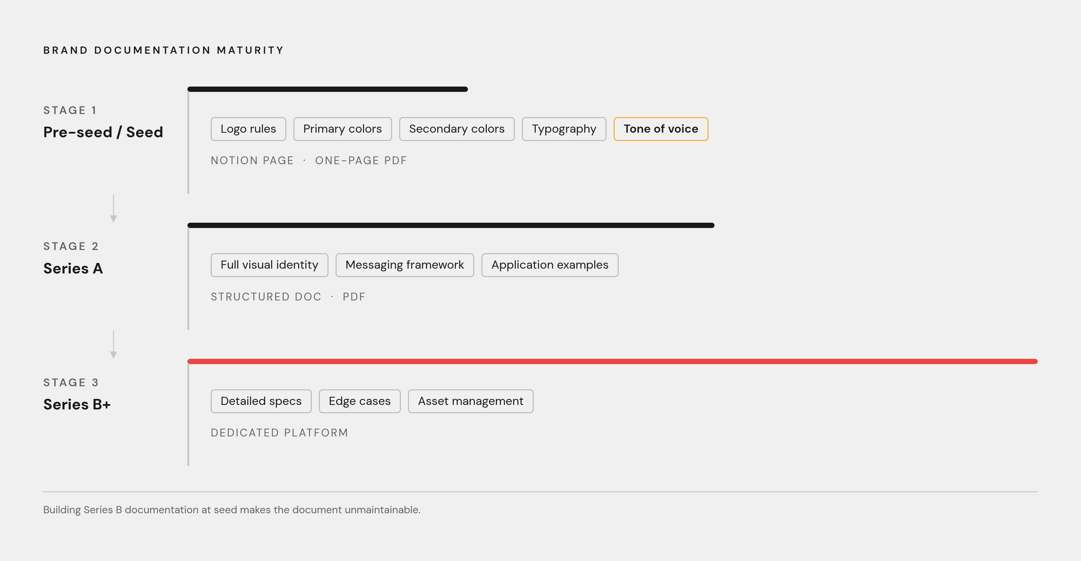
Treat brand documentation like infrastructure that gets built in increments, not one comprehensive system shipped on day one.
At pre-seed and seed, the essentials: logo usage rules, a primary and secondary color palette, typography choices, and a one-page tone of voice summary. A Notion page or a short PDF covers it. At Series A, the document grows into complete documentation: the full visual identity system, a messaging framework, and real application examples showing the brand at work across channels. At Series B and beyond, it becomes comprehensive living documentation, with detailed specifications, edge-case rules, and asset management, often hosted in a dedicated platform rather than a static file that someone has to remember to update.
| Stage | What the document covers | Typical format | |---|---|---| | Pre-seed / Seed | Logo rules, primary and secondary colors, typography, one-page tone of voice | Notion page or short PDF | | Series A | Full visual identity system, messaging framework, application examples | Structured doc or PDF | | Series B+ | Detailed specs, edge cases, asset management | Dedicated platform |
Building the Series B version at seed doesn't make a startup more disciplined. It makes the document unmaintainable, because a two-person team has no one to enforce a hundred edge-case rules, and a document nobody maintains is worse than no document, since it creates the illusion of coverage while the brand drifts underneath it anyway.
What to put in a seed-stage brand guidelines document, section by section
Five sections, and nothing more, belong in the first version of this document. Resist the urge to pad it with things that feel important but aren't urgent yet; those come later.
Logo usage comes first: the approved variations (full color, monochrome, reversed), a minimum size, clear space rules, and a handful of explicit do-not-do examples. This is the section founders most often think they've already covered, because the logo file sits in a shared drive somewhere, and it's the section that falls apart fastest in practice, because nobody wrote down that the logo shouldn't be stretched, recolored, or dropped onto a busy photo background.
Color palette and typography follow. Document a primary and secondary color palette with actual hex codes, not just swatches that live in someone's head. For typography, name one primary typeface for headlines and one for body copy, and write down the scale, heading sizes, body size, caption size, so the system works even when the original designer isn't in the room to make the call.
Tone of voice closes out the core five, and it should fit on one page. Pull two or three real "we say this, not that" examples from actual product or marketing copy already in circulation; a hypothetical example teaches nobody anything, while a real one shows what to avoid.
Starting from a template, rather than a blank document, cuts the production time on all of this substantially. A brand guidelines template supplies the page structure, the section order, and the placeholders; the founder's job is filling in the logo variations, the color codes, the typefaces, and the two or three voice examples. That's most of the labor gone before a single sentence gets written from scratch.
What to add at Series A: messaging framework, imagery rules, and application depth
A seed-stage document starts to crack under its own weight once the team scales past a handful of people and starts working with outside partners. Picture three different agencies, each briefed from the same half-page color and font doc, each producing a visual direction that technically matches the palette and still looks like three different companies. That's what's missing at Series A: the layer of documentation that governs how the brand applies, not just what the brand consists of.
A messaging framework becomes necessary once more than one person is writing external copy, because the one-page tone summary from the seed stage won't carry a team through a product launch, a careers page, and an investor update written by three different people. Without a documented preference for candid shots over posed stock photography, or warm light over clinical white backgrounds, stock photo choices start to diverge even when the colors and type are technically correct.
Iconography and graphic element systems deserve their own entry too, if the brand leans on a consistent illustration style or icon set. This is the section most Series A companies wish they'd documented before the first agency engagement, because briefing an outside team on an icon style that only exists as a vague feeling in the founder's head wastes a full revision cycle, sometimes two. Formalizing these guardrails early is what keeps the cost of scaling the GTM team from showing up as expensive rework six months later.
How a tokenized visual identity system makes the guidelines future-proof
Design tokens solve a specific problem: brands change, and when they do, every file that hardcoded the old version needs to be found and fixed by hand. A token is a named, reusable value, a core color, a type scale, a spacing unit, an icon primitive, defined once in a central place and referenced everywhere else by name.
Without tokens, a color refresh means opening every deck, every social template, and every one-pager, and manually swapping the old hex code for the new one, file by file, hoping nothing gets missed. With tokens, the color exists in one place, named descriptively rather than by its raw value, and every asset references that name. Change the definition once, and every asset that calls it updates. Fifty assets get fixed with one edit.
A seed-stage team doesn't need sophisticated tooling to get this benefit. A single Notion table listing color names and hex codes, or a named color system inside a design file, accomplishes the same thing as an elaborate token pipeline, at a fraction of the setup cost. The discipline is in naming things consistently and making sure every asset points back to the name.
Using AI-assisted design tools to produce and maintain brand assets without a full design team
AI-assisted design tools have changed what a three-person team can produce without hiring an agency, but the tools only work as well as the brand foundation they're reading from. An AI platform can't enforce a brand it has no record of. The prerequisite is the same thing this whole piece has been building toward: defined tokens, a tidy set of components, and documented patterns for how the brand actually behaves.
Once that foundation exists, prompt-to-design workflows become a normal part of shipping marketing assets fast. A team with its colors, type, and tone written down can prompt an AI design platform to generate an on-brand slide, a social post, or a one-pager without starting from an empty canvas every time. Moda is built for exactly this handoff: a founder or GTM operator feeds in the brand parameters already sitting in the guidelines doc, and the platform produces slides, social posts, PDFs, and diagrams on a canvas the user can actually edit, not a flattened image file that can only be regenerated from scratch if something's off.
That editability detail is the whole difference between a design tool and an image generator. AI output should get reviewed the way a junior designer's first draft gets reviewed: checked against the guidelines, adjusted where it drifts, and never published unchecked, because leaning on generated content without a human pass risks sanding down whatever made the brand's voice distinctive in the first place.
Closing that gap is the point of building brand rules directly into the design canvas itself, so a team member produces something on-brand without leaving the workflow they're already in or needing a design course first.
The highest-leverage templates a seed-stage team should build first
A guidelines document without templates is a reference nobody opens under deadline pressure. The real payoff comes from turning the rules into four or five ready-to-use templates for the assets the team is already producing weekly, so following the guidelines becomes the path of least resistance.
Start with the email signature. It's the lowest-effort, highest-frequency brand touchpoint a startup has, seen by every external contact, every day, and it stays consistent across a growing team only when there's a template to copy from. Social post templates come next: at minimum one square format and one landscape format, sized for whatever channels the team actually posts to, and built as editable templates rather than static images, so the copy can change without redoing the design from zero.
And even at seed stage, customer proof matters enough to warrant its own template: a reusable case study cover that keeps social proof assets looking consistent no matter who on the team ends up producing them.
Documenting the color palette, the type rules, and the logo variations is step one. Step two is making sure anyone on the team, not just the designer, can actually apply those rules without asking for help. A Notion page works fine as a reference, but the real test is whether a non-designer founder or a sales rep can produce a polished slide in under ten minutes without pinging the one person who understands the brand. If that's not happening yet, the guidelines exist on paper without being operational in practice.
When to upgrade the guidelines, and the signals that tell you it's time
Funding rounds aren't the real trigger for expanding a brand guidelines document.
Watch for four signals. New hires or contractors keep producing work that's visibly off despite having access to the document. The guidelines themselves are incomplete for how many people are now relying on them.
Brand maintenance doesn't stop once the first document ships. A brand that holds together at ten people won't hold together at a hundred without regular audits, and those audits are what catch the drift early, before it turns into a full rebrand project nobody budgeted for. When one of the four signals occurs, the fix is rarely starting over. It's adding the next layer the current guidelines are missing, following the same staged logic laid out earlier in this piece, from a one-page seed document, to the fuller Series A system, to the living documentation that comes after. Build the first templates from whatever the guidelines say today, put them in a canvas a non-designer can actually edit, and let the document grow the way the company does: one real gap at a time, not all at once.